Total Chart by Donation Type – Visualizing Financial Performance
RJ0800016_21
- Last Update 08/04/2025
- File Size 0.3MB
- # of Slides 2
- File Format PPTX
- Slide Ratio 16:9
- Color
Keywords
- #Content-Based Slides
- #Design-Based Slides
- #Business Strategy
- #Financial Plans and Performance
- #Graph
- #Achievements
- #Sales and Revenue
- #Horizontal Bar
- #Segmented Horizontal Bar
- #16:9
- #horizontal bar chart PowerPoint
- #donation visualization slide
- #financial performance graph template
- #3-series bar chart
- #donation type comparison PPT
- #data analysis slide template
- #how to create bar chart in PowerPoint
About the Product
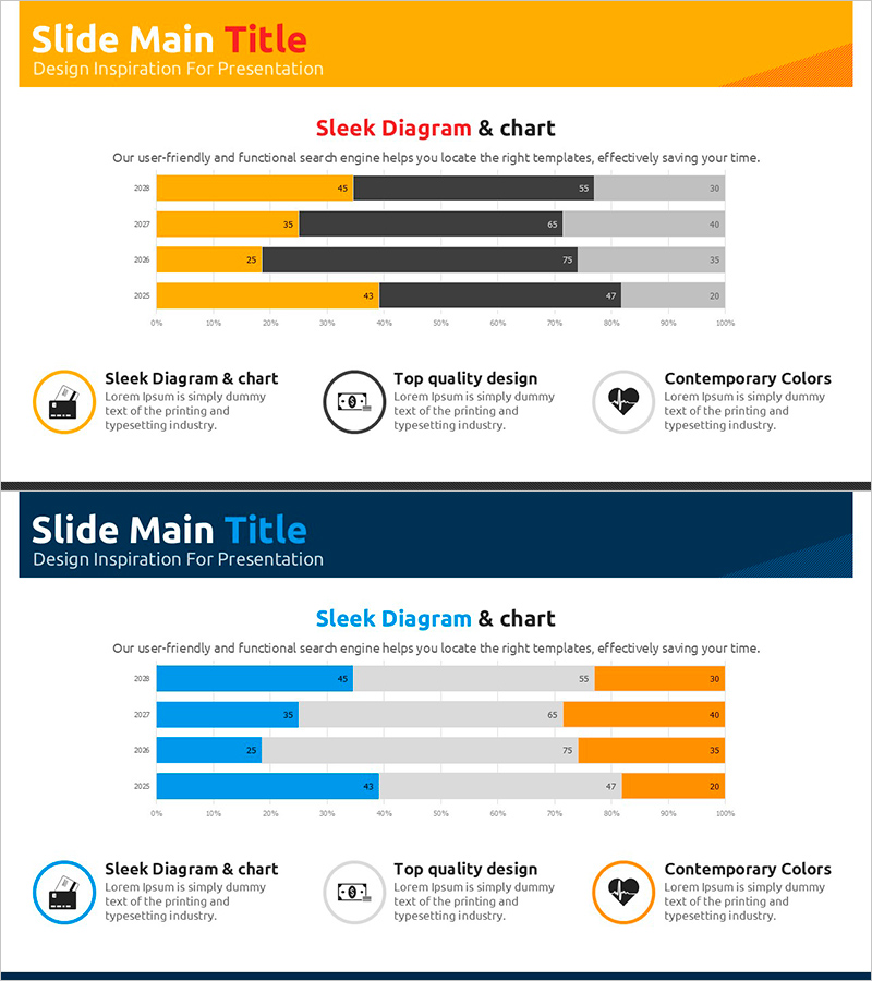
A horizontal bar chart PowerPoint slide visualizing total donations by type across three data series. The slide features orange, black, and gray color-coded bars comparing financial performance across four years (2025–2028). Perfect for financial performance reports, fundraising presentations, donation distribution updates, and business analysis decks. Provided in 16:9 widescreen PPTX format with fully editable data values and legends for immediate customization and deployment.
Usage Points
-
Main Usage
Visualizes donation totals, fund distribution, and financial performance metrics across multiple years and categories. The three-series horizontal layout enables direct comparison of values within each year group, making data patterns immediately apparent to audiences.
-
How to Use
Integrate into financial reports, fundraising presentations, annual performance reviews, and donation management briefings. Replace sample data and labels with your actual figures; the chart structure automatically scales to accommodate your numbers.
-
Recommended For
Nonprofit finance managers, fundraising directors, grant administrators, CFOs, board members, and development officers presenting donation trends, fund allocation, and financial accountability to stakeholders and donors.
-
Slide Structure
Two-slide set: Slide 1 features orange header with 3-series horizontal bars (4 years, 3 color-coded categories) plus three icon-labeled text boxes below. Slide 2 mirrors the layout with navy header and blue/orange/gray color scheme. Both slides include axis labels, legend, and editable data points.
Related Products
-

Horizontal Segmentation Bar Graph for Business Performance Analysis – Innovative Strategy
#Business Strategy #Financial Plans and Performance #Diagram
-

Horizontal Bar Chart Slide | Data Comparison & Analysis PPT
#Business Strategy #Financial Plans and Performance #Graph
-

Stacked Bar Graph by Year with Detailed Breakdown - Market Analysis Insights
#Market and Competitor Analysis #Financial Plans and Performance #Graph
-

Red Financial Growth Bar Graph – Enhancing Business Performance
#Business Strategy #Financial Plans and Performance #Graph
