Area Chart for Market Share Analysis – Global Business PowerPoint Template
RJ0200004_10
- Last Update 03/29/2025
- File Size 1MB
- # of Slides 2
- File Format PPTX
- Slide Ratio 16:9
- Color
Keywords
- #Content-Based Slides
- #Design-Based Slides
- #Market and Competitor Analysis
- #Graph
- #Market Share
- #Competitive Advantage
- #Other
- #Area Chart
- #16:9
- #area chart PowerPoint
- #area graph slide template
- #market share analysis presentation
- #two-series data visualization
- #competitive analysis slide
- #trend analysis PowerPoint template download
About the Product
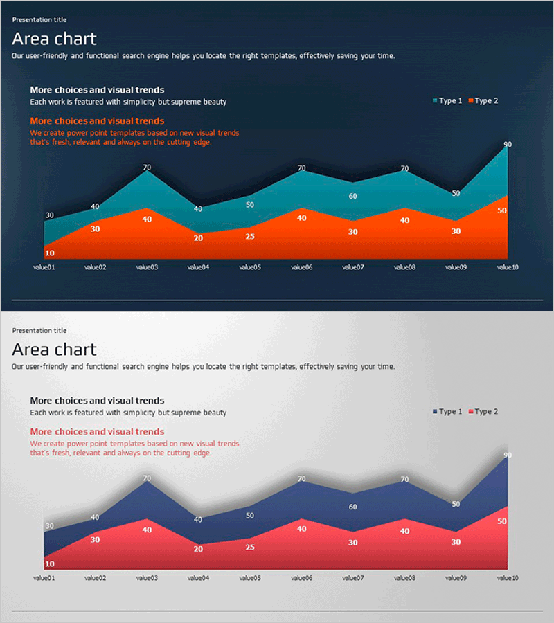
A two-series area chart PowerPoint slide that visualizes data trends over time for market share comparison and competitive analysis. The dark blue background with orange and teal area fills creates clear visual separation between data series across 10 data points. Each area includes numeric labels for precise value reference, making it ideal for business reports, strategy presentations, and investor pitches. The 16:9 widescreen format with 2-slide layout allows flexible customization for various presentation contexts and data scenarios.
Usage Points
-
Main Usage
Visualize cumulative changes of two or more data series over time using stacked area fills, enabling clear comparison of market share, revenue composition, and customer segment distribution. Effectively highlight competitive advantages or demonstrate business unit contribution trends to stakeholders and decision-makers.
-
How to Use
Insert quarterly or annual data in the 'Market Analysis' or 'Performance Review' section of reports to display trends visually. Use in investor presentations to emphasize competitor share shifts, and in strategy meetings to explain departmental revenue composition changes. Edit colors and data values to align with corporate branding and specific business metrics.
-
Recommended For
Finance and strategy managers, marketing planners, executive report coordinators, investor relations specialists, and market analysts who need to communicate competitive positioning, market trends, and business performance quantitatively. Suitable for quarterly earnings reports, business plan presentations, and investor roadshow materials.
-
Slide Structure
Two-series stacked area chart with 10 data points labeled on the X-axis (value01 through value10) and numeric scale on the Y-axis. Numeric labels are positioned within each area section for precise value identification. Legend indicates Type 1 and Type 2 series. Dark blue background with orange and teal area fills provides strong contrast for optimal data readability and visual hierarchy.
Related Products
-

Purple Brown Competitive Advantage Donut Graph – Visualizing Market Share
#Market and Competitor Analysis #Graph #Market Share
-

Investment Ratio Comparison – Market Share Analysis
#Market and Competitor Analysis #Graph #Market Share
-

Mountain Climbing Market Share and Customer Analysis Donut Chart
#Market and Competitor Analysis #Market Share #Competitive Advantage
-

Watercolor Customer Analysis Donut Chart – Visualizing Market Share
#Market and Competitor Analysis #Graph #Market Share
