Abstract Pattern Area Chart Template – Distinctive Data Visualization
RJ0200033_8
- Last Update 04/07/2025
- File Size 0.3MB
- # of Slides 2
- File Format PPTX
- Slide Ratio 16:9
- Color
Keywords
- #Content-Based Slides
- #Design-Based Slides
- #Market and Competitor Analysis
- #Graph
- #Other
- #Market Analysis
- #Competitive Advantage
- #Other
- #Area Chart
- #16:9
- #stacked area chart PowerPoint
- #area graph template
- #time-series data visualization
- #3-series area chart slide
- #trend analysis presentation template
About the Product
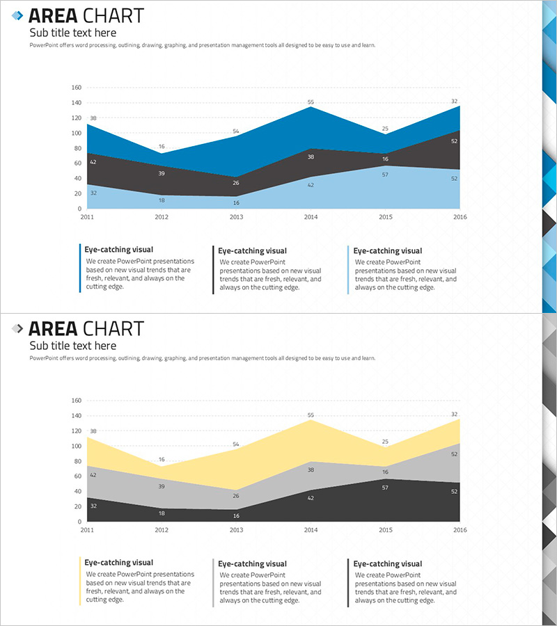
A stacked area chart PowerPoint slide that visualizes 6 years of data trends (2011–2016) across three data series. The cumulative area graph uses blue, gray, and black color schemes to display both individual series progression and total aggregate changes. The 2-slide set features the first slide emphasizing the blue series and the second highlighting yellow, gray, and black series, accommodating diverse presentation scenarios. Ideal for market analysis, revenue trends, customer segment evolution, and time-series data comparisons in business presentations.
Usage Points
-
Main Usage
Optimized for displaying long-term time-series data spanning 6+ years across 3+ categories in cumulative format. Simultaneously shows absolute values of each series and total aggregate changes, making it ideal for communicating market size evolution, revenue composition shifts, and customer demographic changes.
-
How to Use
The first slide emphasizes the blue series to highlight key metrics, while the second slide presents all series in balanced proportion for comparative analysis. Input actual data values at each year marker and modify the legend to match your dataset. Colors and data points are fully editable.
-
Recommended For
Executive reports, business performance presentations, market analysis documents, financial results briefings, and strategic planning meetings. Particularly useful for marketing teams, sales departments, finance teams, and business planning units presenting quarterly or annual performance.
-
Slide Structure
2-slide set. Each slide contains a 6-year X-axis (2011–2016), Y-axis range 0–160, and 3 cumulative data series. Slide 1 emphasizes blue series; Slide 2 highlights yellow, gray, and black series, offering different analytical perspectives on the same dataset.
Related Products
-

Orange Hexagon Presentation Template Area Chart
#Business Strategy #Market and Competitor Analysis #Graph
-

Newspaper Wide PowerPoint Template Map3 - Optimized for Market and Competitor Analysis
#Market and Competitor Analysis #Other #Market Analysis
-

Gradient Theme Area Diagram – Market and Competitor Analysis
#Market and Competitor Analysis #Diagram #Graph
-

Goal Achievement Analysis Area Graph – Data-driven Competitive Edge
#Market and Competitor Analysis #Graph #Other
