Idea Derived Presentation Template – Table & Line Chart
RJ0200002_12
- Last Update 03/29/2025
- File Size 0.4MB
- # of Slides 2
- File Format PPTX
- Slide Ratio 16:9
- Color
Keywords
- #Content-Based Slides
- #Design-Based Slides
- #Financial Plans and Performance
- #Diagram
- #Graph
- #Key Financial Indicators
- #Table
- #Line
- #Standard Table
- #Line Chart
- #16:9
- #line chart PowerPoint slide
- #multi-series trend analysis
- #3-series line graph
- #data comparison chart
- #financial analysis PowerPoint template
About the Product
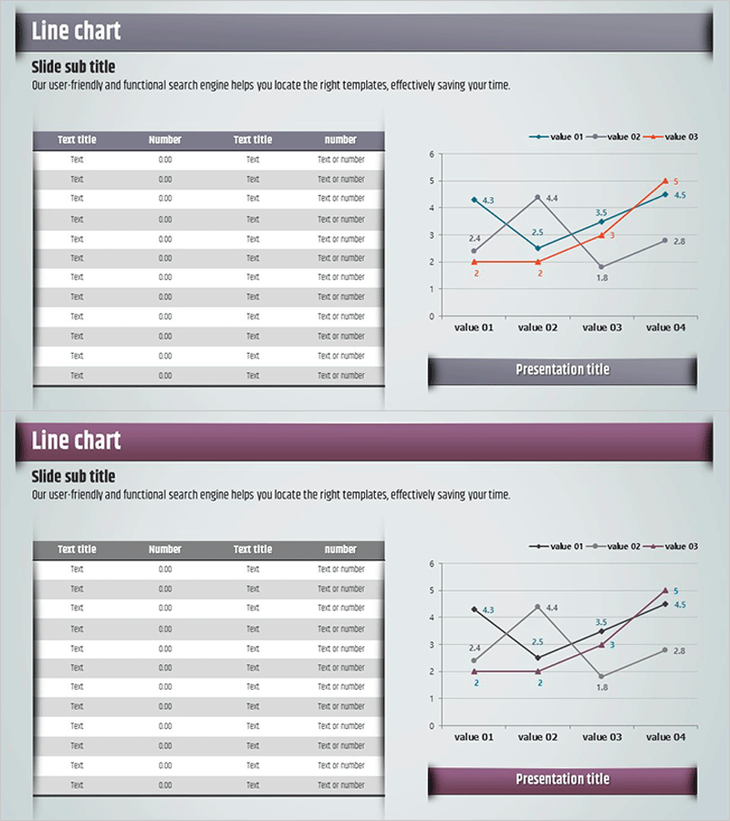
A multi-series line chart PowerPoint slide that visualizes three data sets across four time points. Each series is color-coded in blue, orange, and gray for clear comparative analysis. The layout combines a data table on the left with a corresponding line graph on the right, enabling simultaneous presentation of raw numbers and visual trends. This presentation template is ready to use for financial performance reports, sales trend analysis, growth rate comparisons, and any business presentation requiring trend visualization.
Usage Points
-
Main Usage
Effectively displays numerical changes over time and enables simultaneous comparison of multiple data series. Ideal for visualizing financial performance trends, sales volume changes, growth rate comparisons, and market share fluctuations to enhance audience comprehension.
-
How to Use
Input actual data values into the left table, and the right graph updates automatically. Adjust series colors and line styles to emphasize key points, and customize legend and axis labels to match your presentation context.
-
Recommended For
Recommended for finance teams presenting quarterly and annual performance reports, marketing teams analyzing campaign effectiveness, sales teams presenting sales trends, and executive presentations requiring data-driven insights. Suitable for any business presentation involving trend analysis.
-
Slide Structure
Two-slide set with each slide featuring a 10-row × 4-column data table on the left and a 3-series line graph on the right. The graph displays a Y-axis range of 0–6 and X-axis with four intervals (value 01–04), with data point labels at each intersection.
Related Products
-

New Semester Template Table – Visualizing Financial Planning and Performance
#Financial Plans and Performance #Diagram #Projected Return on Investment (ROI)
-

Red Purple Highlight Table – An Ideal Choice for Financial Planning
#Financial Plans and Performance #Diagram #Budget
-

Financial Indicators and Income Statements – Current Trends and Statistics
#Financial Plans and Performance #Diagram #Income Statement
-

Sales and Profit Analysis Table – Essential Tool for Presentation
#Financial Plans and Performance #Diagram #Other
