Market Trend Analysis Graph & Table Chart – Insightful Data Visualization
RM0400005_6
- Last Update 02/15/2025
- File Size 4.1MB
- # of Slides 2
- File Format PPTX
- Slide Ratio 16:9
- Color
Keywords
- #Content-Based Slides
- #Design-Based Slides
- #Market and Competitor Analysis
- #Diagram
- #Graph
- #Competitor Analysis
- #Industry Trends
- #Table
- #Line
- #Standard Table
- #Line Chart
- #16:9
- #line chart PowerPoint slide
- #market trend analysis template
- #dual-series chart template
- #data visualization PowerPoint
- #business report graph
- #trend analysis slide template
About the Product
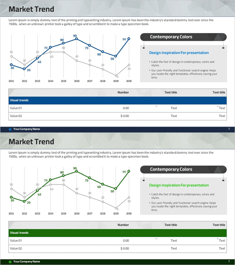
A professional line chart PowerPoint slide designed to visualize market trends and data changes over time. This presentation template features a dual-series line graph tracking data from 2010 to 2030, with 10 data points per series clearly labeled with numerical values. The color scheme uses dark blue and light gray to distinguish primary and secondary metrics, ensuring clear visual hierarchy. Includes a supporting data table below the chart for detailed reference. Perfect for business reports, competitive analysis presentations, market analysis sessions, and executive dashboards that require precise trend visualization and comparative data representation.
Usage Points
-
Main Usage
Visualize and compare two or more data series over time, such as market trends, sales performance, revenue growth, or competitive metrics. The line chart effectively highlights inflection points, growth rates, and trend reversals, making complex temporal data immediately understandable to audiences.
-
How to Use
Use in quarterly business reviews, executive presentations, market analysis sessions, and competitive benchmarking reports. Double-click the chart to edit data values directly in PowerPoint. Customize axis labels, legend text, and color schemes to match your presentation context and corporate branding guidelines.
-
Recommended For
Executives, marketing managers, financial analysts, business development professionals, management consultants, and data analysts. Particularly effective for presenting quarterly performance reviews, market share evolution, customer satisfaction trends, and competitive positioning analysis.
-
Slide Structure
Title area (Market Trend) at top, dual-series line graph occupying center-left (2 data series, 10 data points from 2010-2030 with value labels), Contemporary Colors text box on right side, and Visual trends data table (3 columns × 2 rows) at bottom. Optimized for 16:9 widescreen format.
Related Products
-

Market Trend Analysis Broken Line Graph – Competitor Analysis
#Market and Competitor Analysis #Diagram #Graph
-

Market Trend Analysis Graph & Table Chart
#Market and Competitor Analysis #Diagram #Graph
-

Competitor Analysis Broken Line Graph – Market Trends and Vision
#Market and Competitor Analysis #Graph #Competitor Analysis
-

Comparison Graph of Yearly Trends – Market and Competitor Analysis
#Market and Competitor Analysis #Diagram #Graph
