Wide Bar Chart for Analyzing Sales Performance – Visualizing Market Status
RJ0200001_14
- Last Update 03/28/2025
- File Size 0.1MB
- # of Slides 2
- File Format PPTX
- Slide Ratio 16:9
- Color
Keywords
- #Content-Based Slides
- #Design-Based Slides
- #Market and Competitor Analysis
- #Financial Plans and Performance
- #Graph
- #Market Status
- #Sales and Revenue
- #Horizontal Bar
- #Grouped Horizontal Bar
- #16:9
- #horizontal bar chart PowerPoint
- #grouped bar graph template
- #year-over-year comparison slide
- #sales performance visualization
- #multi-series data chart
- #how to create grouped bar chart in PowerPoint
About the Product
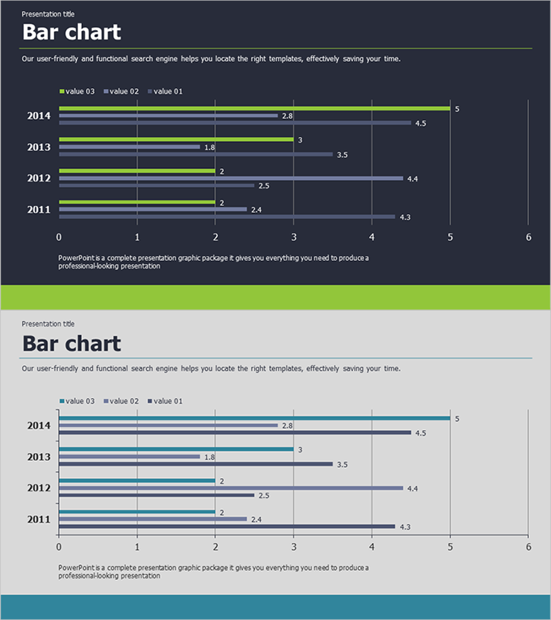
A horizontal bar chart PowerPoint slide that visualizes annual sales performance and market status across multiple data series. This presentation template displays 5 years of data (2011–2014) with 3 series in grouped bar format, enabling clear comparison of year-over-year trends and performance differences between series. The dark background version features lime green, light blue, and charcoal bars with contrasting colors for distinct series identification, while data value labels are included for immediate readability. The light background version offers an alternative color scheme in teal, gray, and navy. Fully editable in 16:9 widescreen PPTX format across 2 slides, ready for financial reports, business performance presentations, and market analysis decks.
Usage Points
-
Main Usage
Compare annual sales performance and market trends across multiple data series using grouped horizontal bars. Visualize 5-year trends with simultaneous display of year-over-year growth rates and inter-series performance gaps. Suitable for financial data, sales figures, market share metrics, and any multi-series numerical comparison.
-
How to Use
Insert into financial reports, business performance presentations, or market analysis decks as your data visualization section. Replace existing data by editing bar lengths and value labels; the chart automatically adjusts. Customize colors, axis ranges, and legend freely to match your presentation theme or corporate branding.
-
Recommended For
Finance professionals, marketing analysts, and executive-level presentations. Recommended for quarterly or annual performance comparisons in business plans, investor pitch decks, and management reports. Ideal for any business presentation requiring clear multi-series data comparison and trend analysis.
-
Slide Structure
2-slide set. Slide 1: Dark background with 5 grouped horizontal bars (2011–2014) in lime green, light blue, and charcoal, with value labels at bar ends. Slide 2: Light background with identical data in teal, gray, and navy for alternative styling. Both slides include axis labels, gridlines, and legend. 16:9 widescreen PPTX format, fully editable.
Related Products
-

Slide Comparing Sales Trends by Year – Data Visualization
#Market and Competitor Analysis #Financial Plans and Performance #Diagram
-

Trends in Visits to Traditional Villages – Data Visualization of Market Status
#Market and Competitor Analysis #Financial Plans and Performance #Graph
-

Office Supplies Theme Bundle Bar Graph – Market Status Analysis
#Market and Competitor Analysis #Graph #Market Status
-

Visualize Coffee Sales Status with Donut Chart – Market Analysis
#Market and Competitor Analysis #Financial Plans and Performance #Graph
