Slide Comparing Sales Trends by Year – Data Visualization
RB0800042_3
- Last Update 03/25/2025
- File Size 0.2MB
- # of Slides 2
- File Format PPTX
- Slide Ratio 4:3
- Color
Keywords
- #Content-Based Slides
- #Design-Based Slides
- #Market and Competitor Analysis
- #Financial Plans and Performance
- #Diagram
- #Graph
- #Market Status
- #Sales and Revenue
- #Cluster
- #Horizontal Bar
- #Chain Diagram
- #Grouped Horizontal Bar
- #4:3
- #grouped bar chart PowerPoint
- #year-over-year sales comparison slide
- #4-series data visualization
- #bar graph presentation template
- #financial data chart download
About the Product
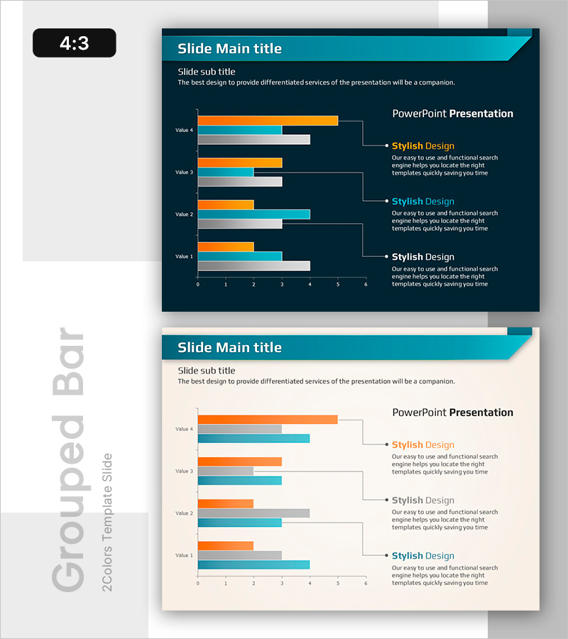
A grouped bar chart PowerPoint slide comparing year-over-year sales trends across 4 data series. Set against a dark blue background, the slide features orange, light blue, and gray bar clusters that clearly visualize differences between data points. Each year displays 4 values (Value 1–4) as horizontal bars, with a dedicated text area on the right for adding insights and analysis. This presentation template is ideal for financial reports, business plans, and market analysis presentations where you need to communicate sales performance, revenue trends, and comparative metrics effectively.
Usage Points
-
Main Usage
Designed to compare 4 data items (such as annual sales, quarterly revenue, or performance metrics) simultaneously and analyze trends over time. Perfect for displaying financial performance, market share, departmental results, or multi-product sales comparisons in a single, easy-to-understand visual format.
-
How to Use
Adjust bar lengths to input your actual data values, then add key insights or analysis text in the right-side text area. You can modify data labels, update the legend, and change colors while maintaining the design consistency. The 4:3 aspect ratio ensures compatibility with all standard projector environments.
-
Recommended For
Finance teams, executives, marketing departments, and sales teams preparing quarterly or annual performance reports, business plans, and investor presentations. Especially effective when comparing performance across multiple departments, products, or geographic regions simultaneously.
-
Slide Structure
2-slide set, each featuring a grouped horizontal bar chart with 4 data series (Value 1–4) and a dedicated text explanation area on the right. Design includes a dark blue header bar, 4-color bar clusters (orange, light blue, gray, black), and dotted connector lines linking data to descriptions.
Related Products
-

Wide Bar Chart for Analyzing Sales Performance – Visualizing Market Status
#Market and Competitor Analysis #Financial Plans and Performance #Graph
-

Time Usage by Work Area – Market Analysis
#Market and Competitor Analysis #Diagram #Graph
-

Market Analysis with Five Color Pie Charts – Stylish Design
#Market and Competitor Analysis #Financial Plans and Performance #Graph
-

Visualizing Product-specific Target Achievement Percentage – Cluster Diagram
#Company Introduction #Financial Plans and Performance #Diagram
