Data Comparison: Then vs. Now – Performance and Competitive Edge
RB0800075_8
- Last Update 03/28/2025
- File Size 0.1MB
- # of Slides 2
- File Format PPTX
- Slide Ratio 4:3
- Color
Keywords
- #Content-Based Slides
- #Design-Based Slides
- #Business Strategy
- #Market and Competitor Analysis
- #Graph
- #Achievements
- #Competitive Advantage
- #Column
- #Column Chart
- #4:3
- #dual bar chart PowerPoint
- #data comparison slide template
- #bar graph presentation
- #performance comparison chart
- #competitive analysis PPT
About the Product
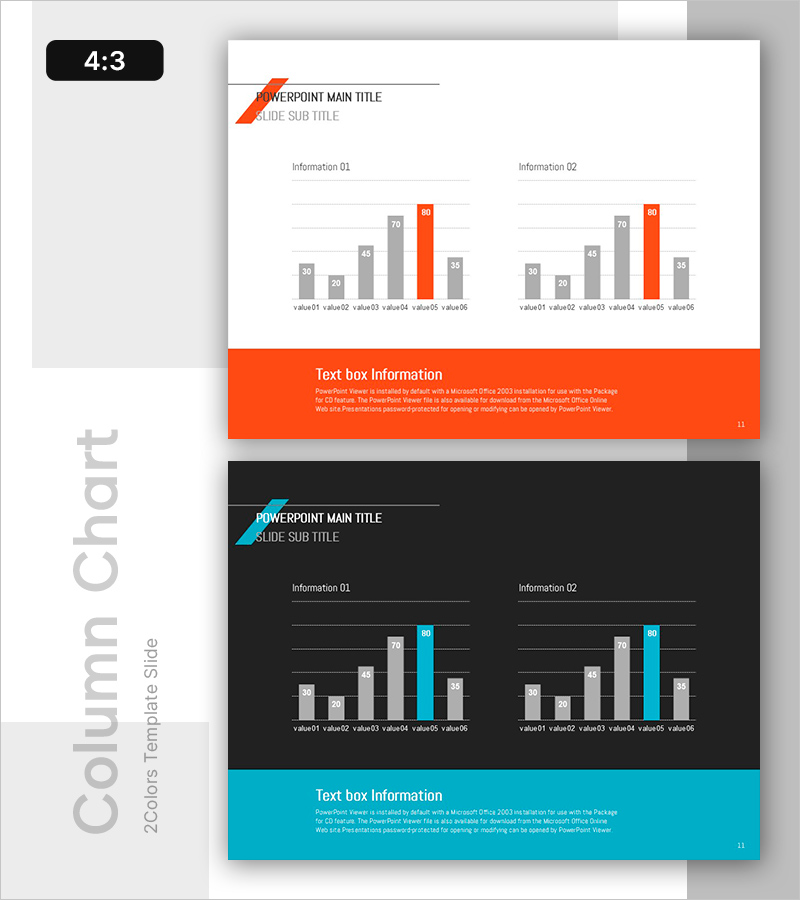
A dual bar chart PowerPoint slide that visually compares past and present performance metrics. Two information sections display six data items each, enabling simultaneous representation of competitive advantage and growth trends. The orange accent color contrasts with gray tones to highlight key figures, and the 4:3 ratio format with 2 slides is ready for immediate use. This presentation template is optimized for time-series data and competitive analysis in business reports, strategy presentations, and performance reviews.
Usage Points
-
Main Usage
Designed to visualize time-series data or competitive benchmarking analysis. Two side-by-side information sections allow simultaneous display of change trends and relative comparisons, while the orange accent color ensures key metrics are immediately recognized by the audience.
-
How to Use
Input actual values into the six bars in each section and update the legend labels. During presentation, compare left (past/competitor/baseline) versus right (present/your company/target), or reveal performance progression quarter-by-quarter or year-over-year.
-
Recommended For
Ideal for executive reports, strategy planning presentations, marketing performance analysis, financial results briefings, product competitiveness assessments, and organizational performance evaluations. Particularly effective for CFOs, marketing managers, strategy planners, and sales directors presenting quantitative evidence.
-
Slide Structure
2-slide format. Each slide features a title area (with orange arrow accent) and content area containing two side-by-side information sections. Each section includes 6 bars (alternating gray and orange), X-axis labels, Y-axis gridlines, and an orange text box at the bottom for additional commentary.
Related Products
-

Visualizing Plant Growing Market Size – Achievements and Competitive Edge
#Business Strategy #Market and Competitor Analysis #Graph
-

Visually Enhanced Bar Graph by Promotional Product Performance
#Business Strategy #Market and Competitor Analysis #Graph
-

Bar Chart Visualizing Steak Consumption
#Business Strategy #Market and Competitor Analysis #Graph
-

Data Analysis PPT for Households with Pets
#Business Strategy #Market and Competitor Analysis #Graph
