Operational Breakdown in Donut Chart – Innovative Data Visualization
RB0800055_8
- Last Update 03/26/2025
- File Size 0.3MB
- # of Slides 2
- File Format PPTX
- Slide Ratio 4:3
- Color
Keywords
- #Content-Based Slides
- #Design-Based Slides
- #Product/Service Introduction
- #Technical Approach
- #Graph
- #Development Status
- #Innovative Technologies and Future Plans
- #Circles
- #Doughnut Chart
- #4:3
- #donut chart PowerPoint
- #pie chart slide template
- #operational data visualization
- #percentage chart
- #graph PowerPoint slide
About the Product
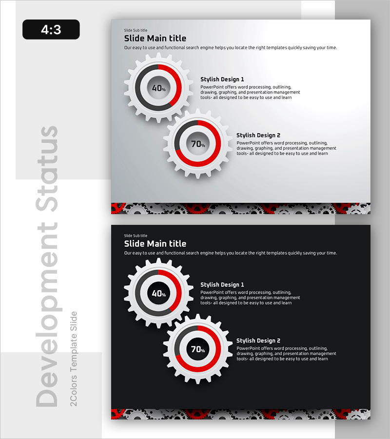
A professional donut chart PowerPoint slide designed to visualize operational metrics and performance data. Featuring two donut charts with red, black, and gray color scheme on a neutral gray background, displaying percentage values (40%, 70%) for clear data representation. This 4:3 ratio, 2-slide template is ideal for product introductions, technical status reports, development progress tracking, and operational analysis presentations. The intuitive circular chart format helps audiences quickly grasp proportional relationships and key performance indicators.
Usage Points
-
Main Usage
Visualize operational analysis, product features, technical status, and development progress using donut chart format. Two side-by-side donut charts enable simultaneous comparison of two metrics, while percentage displays ensure clear quantitative communication to your audience.
-
How to Use
Insert into presentation sections covering technical explanations, operational updates, or product feature comparisons to enhance audience comprehension. Simply edit the percentage values and accompanying text to match your specific data. The gray background with red accent color adapts seamlessly to various industry presentations and corporate environments.
-
Recommended For
Product development teams, technical managers, operations directors, and marketing strategists presenting progress metrics, performance data, and proportional analysis. Suitable for business reports, product launch presentations, technical seminars, and quarterly operational briefings.
-
Slide Structure
Two-slide set, each featuring dual donut charts with percentage indicators. Layout includes title area at top, two centered donut charts (40% and 70% displays), descriptive text section on the right, and decorative pattern element at bottom for visual cohesion and professional appearance.
Related Products
-

Market Share Analysis Donut Chart – Competitive Edge in the Market
#Product/Service Introduction #Market and Competitor Analysis #Graph
-

Idea Development Status Donut Graph – Effective Market Analysis
#Product/Service Introduction #Market and Competitor Analysis #Graph
-

Analysis of Work Progress – Utilizing Pie Chart
#Product/Service Introduction #Market and Competitor Analysis #Graph
-

Analysis graph of market share progress
#Product/Service Introduction #Market and Competitor Analysis #Graph
