Analysis of Work Progress – Utilizing Pie Chart
RJ0300086_21
- Last Update 05/13/2025
- File Size 0.9MB
- # of Slides 2
- File Format PPTX
- Slide Ratio 16:9
- Color
Keywords
- #Content-Based Slides
- #Design-Based Slides
- #Product/Service Introduction
- #Market and Competitor Analysis
- #Graph
- #Development Status
- #Market Share
- #Circles
- #Doughnut Chart
- #16:9
- #donut pie chart PowerPoint
- #pie chart slide template
- #ratio visualization PPT
- #data visualization slides
- #4-segment chart template
- #PowerPoint chart design
About the Product
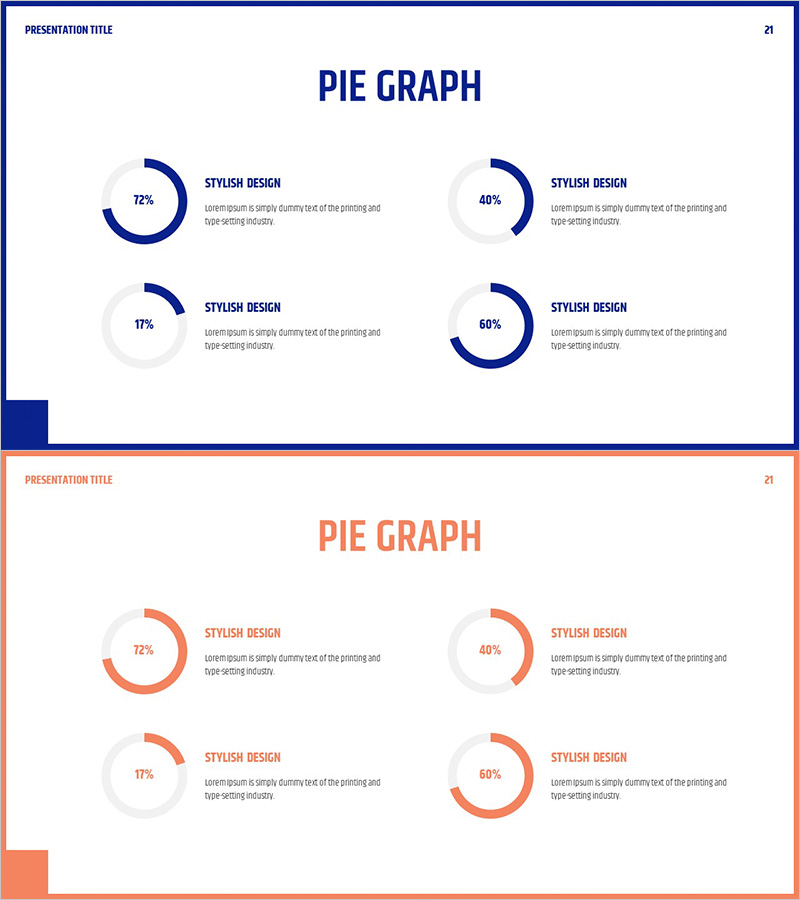
A donut-shaped pie chart PowerPoint slide set designed to visualize ratio data such as work progress, market share, and budget allocation. The 2-slide deck provides two color versions: blue and orange themes. Each slide features four donut charts arranged in a 2×2 grid layout, enabling simultaneous comparison of multiple data categories. Percentage values and descriptive text areas are positioned alongside each chart for clear data interpretation. Created in 16:9 widescreen format optimized for modern projectors and displays, with all elements fully editable for immediate use in presentations.
Usage Points
-
Main Usage
Donut pie charts excel at intuitively displaying the proportion of each item relative to the whole. Ideal for work progress analysis, market share comparison, budget allocation status, customer composition analysis, product sales ratio, and any presentation scenario requiring emphasis on compositional proportions.
-
How to Use
Double-click the percentage value in each donut chart to replace it with actual data, then enter item names in the descriptive text areas. To change colors, select the shape and apply your desired color from the fill options. The 2×2 grid layout allows simultaneous comparison of four items; copy and paste shapes to add additional data points as needed.
-
Recommended For
Recommended for executive reports, business performance presentations, marketing analysis materials, financial status explanations, organizational structure introductions, and project progress updates. Particularly effective for executive-level presentations, investor briefings, and interdepartmental collaboration meetings where quantitative data must be explained from a ratio perspective.
-
Slide Structure
2-slide set. Each slide contains four donut-shaped pie charts arranged in a 2-row, 2-column grid. Each chart displays percentage values at center with item names and descriptive text areas on the right. Slide 1 uses blue color scheme (navy blue and light gray), Slide 2 uses orange theme (coral orange and light gray). 16:9 widescreen format with all elements fully editable.
Related Products
-

Doughnut Chart Visualizing Current Status of 3D Printing Technology Development
#Product/Service Introduction #Market and Competitor Analysis #Graph
-

Financial Business Analysis Pie Chart – Market Share Insights
#Product/Service Introduction #Market and Competitor Analysis #Graph
-

Analysis graph of market share progress
#Product/Service Introduction #Market and Competitor Analysis #Graph
-

City Theme Market Share Graph – Business Data Visualization
#Product/Service Introduction #Market and Competitor Analysis #Graph
