Stylish Comparative Column Graph – Market Status and Performance Comparison
RB0800053_5
- Last Update 03/26/2025
- File Size 0.3MB
- # of Slides 2
- File Format PPTX
- Slide Ratio 4:3
- Color
Keywords
- #Content-Based Slides
- #Design-Based Slides
- #Market and Competitor Analysis
- #Financial Plans and Performance
- #Graph
- #Market Status
- #Sales and Revenue
- #Column
- #Grouped Column
- #4:3
- #grouped column chart PowerPoint
- #multi-series bar graph slide
- #year-over-year comparison template
- #financial performance chart PPT
- #data comparison slide download
About the Product
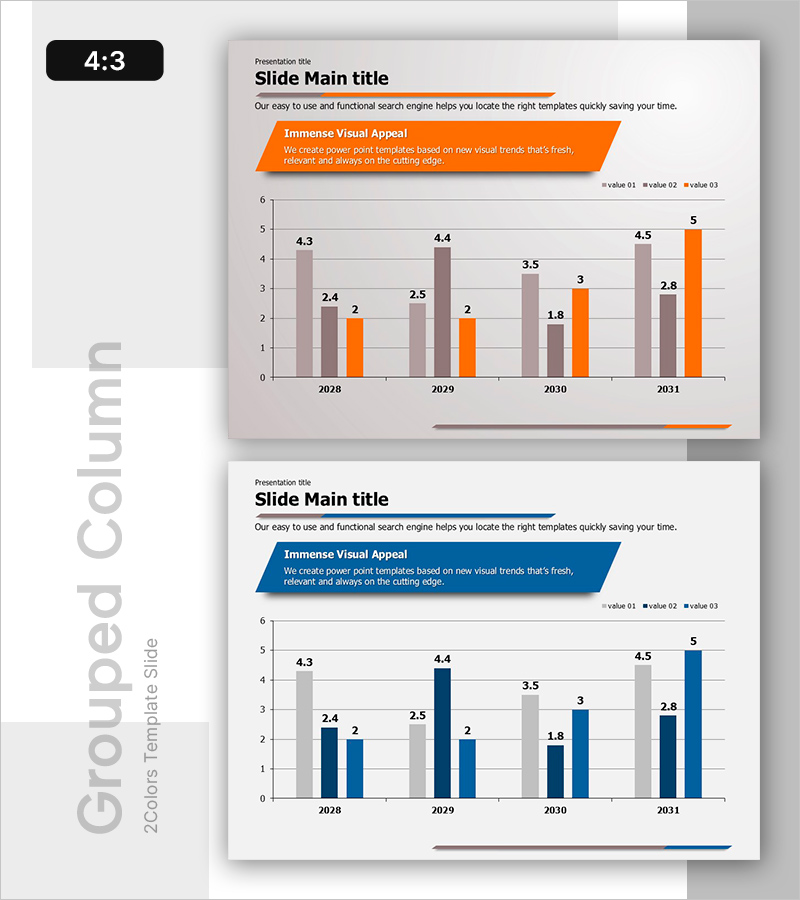
A grouped column chart PowerPoint slide comparing 4 data series across years 2028 to 2031. Orange, gray, and navy bars represent distinct metrics, enabling clear side-by-side comparison of market status, financial performance, and sales results. The 4:3 aspect ratio template includes 2 slides with value labels for enhanced audience comprehension. Fully editable and ready for immediate use in business presentations requiring multi-metric analysis.
Usage Points
-
Main Usage
Visualizes multiple metrics across years or categories to highlight performance trends and competitive positioning. Ideal for quarterly earnings reports, market analysis, sales performance reviews, and strategic planning presentations requiring quantitative data comparison.
-
How to Use
Bar height and color differentiation allow instant visual comparison across series. Reference value labels for precise figures and use the orange accent series to emphasize key metrics. Gray gridlines facilitate accurate value reading and data interpretation.
-
Recommended For
Executive teams, finance departments, marketing teams, and sales divisions presenting quarterly or annual reports. Suitable for business plans, investor pitch decks, marketing strategy presentations, and performance dashboards.
-
Slide Structure
Grouped column chart with 4 data series (value 01, value 02, value 03, and accent series) displayed across 4 years (2028–2031). Each year contains 4 adjacent bars enabling direct series comparison. Includes legend and value labels for clarity.
Related Products
-

Idea Presentation Template for Visualizing Sales Status – Success and Challenge
#Market and Competitor Analysis #Financial Plans and Performance #Graph
-

Analysis of Ship Order Volume – Effective Market Status Graph
#Market and Competitor Analysis #Financial Plans and Performance #Graph
-

Sales and Profit Table – Visualizing Financial Performance
#Market and Competitor Analysis #Financial Plans and Performance #Diagram
-

Purple Green Flower Market Analysis – Market Status and Competitive Analysis
#Market and Competitor Analysis #Financial Plans and Performance #Graph
