Vertical Bar Column Chart (Orange & Green) – Visualizing Sales Performance
RB0800020_8
- Last Update 03/21/2025
- File Size 1.3MB
- # of Slides 2
- File Format PPTX
- Slide Ratio 4:3
- Color
Keywords
- #Content-Based Slides
- #Design-Based Slides
- #Market and Competitor Analysis
- #Financial Plans and Performance
- #Graph
- #Market Status
- #Sales and Revenue
- #Column
- #Column Chart
- #4:3
- #vertical bar chart PowerPoint
- #column chart template
- #dual series graph
- #sales comparison slide
- #data visualization PowerPoint
About the Product
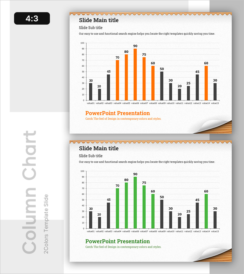
A vertical bar column chart PowerPoint slide designed for sales performance and market analysis presentations. The slide features a dual-series structure with black, orange, and green bars enabling simultaneous comparison of two datasets across 15 items (value01 to value15), with values ranging up to 90. Each data point is clearly labeled with numerical values for precise readability. Provided in 4:3 aspect ratio across 2 slides, this template is ready for immediate use in financial reports, sales performance presentations, and competitive analysis materials. Colors and data values are fully editable to adapt to various business presentation needs.
Usage Points
-
Main Usage
Optimized for comparing two data series across 15 items simultaneously. Ideal for presenting contrasts such as actual vs. target revenue, year-over-year performance, or company vs. competitor metrics, making numerical differences immediately apparent to audiences.
-
How to Use
Apply in financial reports for quarterly performance comparisons, sales meetings for regional revenue analysis, executive briefings for year-over-year trends, and investor presentations for business performance reporting. The bar heights and color coding enable instant visual comparison, reducing presentation time.
-
Recommended For
Finance teams presenting quarterly results, sales departments analyzing regional performance, management briefings on competitive benchmarking, and investor-facing business performance reports. Suitable for any data-driven business presentation requiring multi-series comparison.
-
Slide Structure
Y-axis ranges from 0 to 100, X-axis displays 15 items (value01 through value15). Each item features paired bars—black bars (30–50 range) alongside orange or green bars (20–90 range)—with numerical labels positioned above the taller bar. Title and subtitle area at top; brand name space at bottom.
Related Products
-

AI VC Market Statistics PowerPoint Slide – Bar Chart and KPI
#Market and Competitor Analysis #Financial Plans and Performance #Graph
-

Simple & Modern Wide PowerPoint Vertical Bar Chart
#Market and Competitor Analysis #Financial Plans and Performance #Graph
-

Purple Green Flower Market Analysis – Market Status and Competitive Analysis
#Market and Competitor Analysis #Financial Plans and Performance #Graph
-

Basic Vertical Bar Chart Slide – Market Status Analysis
#Market and Competitor Analysis #Financial Plans and Performance #Graph
