Profit Forecast and Progress Graph – Harmony of Blue and Orange
RJ0400021_12
- Last Update 05/23/2025
- File Size 1.4MB
- # of Slides 2
- File Format PPTX
- Slide Ratio 16:9
- Color
Keywords
- #Content-Based Slides
- #Design-Based Slides
- #Business Strategy
- #Graph
- #Financial Outlook & Expected Impact
- #Column
- #Grouped Column
- #Project Progress
- #16:9
- #column chart PowerPoint
- #revenue trend slide template
- #business progress chart
- #grouped bar graph
- #PowerPoint data visualization
- #financial presentation template
About the Product
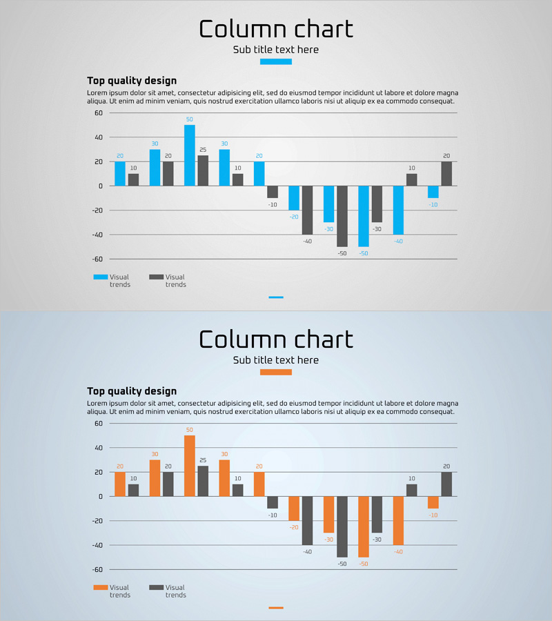
A vertical column chart PowerPoint slide that visualizes business revenue forecasts and project progress. Featuring dual-series grouped columns in blue and orange, this slide enables side-by-side comparison of revenue data across multiple periods. The chart supports both positive and negative values with precise numerical labels displayed above each column for immediate presentation use. Designed in 16:9 widescreen format across 2 slides, optimized for modern business presentations and investor reports.
Usage Points
-
Main Usage
Presents quantitative comparison of business revenue trends and project progress across multiple periods or departments. The dual-series format allows simultaneous visualization of related metrics, making financial performance and operational achievements clearly evident to stakeholders. Ideal for investor presentations, executive briefings, and business review meetings.
-
How to Use
Open the slide and replace existing data values with your actual business figures. The blue and orange color scheme can be retained or customized as needed. Column heights adjust automatically based on input values, and all labels are fully editable. Additional periods or categories can be added by duplicating existing columns and adjusting the data.
-
Recommended For
Finance managers, business planning teams, executives, and investor relations professionals. Suitable for quarterly and annual revenue reporting, project milestone tracking, departmental performance comparison, and competitive analysis. Particularly effective for data-driven decision-making in profitability analysis, performance reviews, and strategic planning sessions.
-
Slide Structure
Two-slide set with title area and chart area on each slide. The column chart features X-axis (time periods or categories) and Y-axis (revenue scale) with dual-series grouped columns in blue and orange. Positive values extend upward while negative values extend downward, providing intuitive visualization of profit and loss scenarios.
Related Products
-

Simple Circle Presentation Template for Column Chart – Clearly Demonstrating Business Performance
#Business Strategy #Graph #Financial Outlook & Expected Impact
-

Progress and Profit Outlook Graph – Harmony of Green and Orange
#Business Strategy #Graph #Financial Outlook & Expected Impact
-

Modern Business Plan Presentation Template Bubble Diagram – Efficient Planning Visualization
#Business Strategy #Diagram #Graph
-

Visualizing Product Sales Performance and Future Outlook with Horizontal Bar Chart
#Business Strategy #Financial Plans and Performance #Graph
