Competitive Market Share Comparison – Visual Data Analysis
RB0800042_9
- Last Update 03/25/2025
- File Size 0.2MB
- # of Slides 2
- File Format PPTX
- Slide Ratio 4:3
- Color
Keywords
- #Content-Based Slides
- #Design-Based Slides
- #Market and Competitor Analysis
- #Graph
- #Market Share
- #Competitive Advantage
- #Circles
- #Pie Chart
- #4:3
- #pie chart PowerPoint slide
- #circular graph presentation
- #market share comparison slide
- #competitive analysis chart
- #data comparison template
- #pie chart template download
About the Product
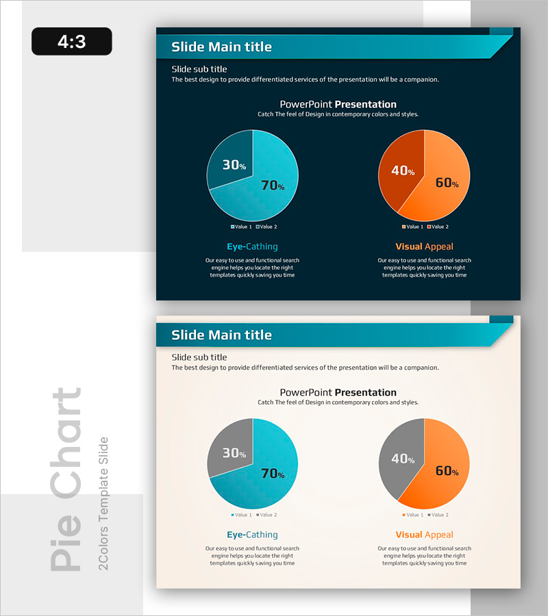
A PowerPoint slide featuring dual pie charts designed to compare market share and competitive positioning at a glance. The contrasting teal and orange color scheme highlights two separate data sets side by side, with each pie chart divided into 2 segments to clearly convey detailed proportions. This slide structure enables intuitive visual comparison of competitive metrics and is ready for immediate use in presentations and reports. Provided in 4:3 aspect ratio PPTX format with fully editable text and numerical values.
Usage Points
-
Main Usage
Ideal for comparing two data sets simultaneously, such as market share between competitors, sales ratios, or customer composition breakdowns. The 2-segment division in each pie chart clearly illustrates the relationship between whole and parts, enabling effective ratio analysis.
-
How to Use
Use in executive reports, business analysis presentations, marketing strategy meetings, and investor pitch decks to explain competitive landscape. Simply edit the numerical values, legend labels, and titles with your own data to create a ready-to-present slide.
-
Recommended For
Recommended for executives, marketing professionals, business analysts, consultants, and sales leaders who rely on data-driven decision-making. Particularly effective for competitive analysis, market research presentations, and performance reporting.
-
Slide Structure
2-slide layout with dual pie charts positioned side by side on each slide. The left chart uses teal color segments (2 divisions), while the right chart uses orange color segments (2 divisions), creating clear visual distinction between the two data sets. Legend and descriptive text areas below each chart allow for contextual information and annotations.
Related Products
-

Coffee Cup Pie Chart – Market Share Analysis
#Market and Competitor Analysis #Graph #Market Share
-

Investment Ratio Comparison – Market Share Analysis
#Market and Competitor Analysis #Graph #Market Share
-

Donut Chart: Urban Energy Source Breakdown – Market Share Analysis
#Market and Competitor Analysis #Graph #Market Share
-

Vegetable Competition Pie Chart – Market Share Analysis
#Market and Competitor Analysis #Graph #Market Share
