Vertical Bar Chart for Data Analysis Visualization – Efficiency and Practicality
RB0800028-1_7
- Last Update 03/23/2025
- File Size 0.4MB
- # of Slides 2
- File Format PPTX
- Slide Ratio 4:3
- Color
Keywords
About the Product
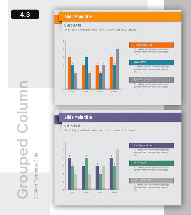
A vertical bar chart PowerPoint slide designed to compare multi-series data across four items with clarity and impact. Features three data series in orange, blue, and gray colors, enabling side-by-side numerical comparison. Ideal for business reports, performance analysis, and data-driven presentations. The PPTX format allows instant customization of values, labels, and colors to match your specific dataset and corporate branding.
Usage Points
-
Main Usage
Compares quantitative data across multiple categories and series, highlighting differences and trends at a glance. Effectively communicates sales figures, performance metrics, budget allocations, and comparative analysis results.
-
How to Use
Bar heights and colors represent data values. Right-side text boxes explain each series (Sleek Diagram & Chart, Visual Appeal, Eye-Catching Visual) to enhance audience comprehension and engagement during presentations.
-
Recommended For
Financial reports, sales performance reviews, marketing analytics, budget presentations, quarterly business reviews, competitive analysis, market research findings, and executive dashboards.
-
Slide Structure
X-axis displays 4 items (Value 1–4), Y-axis ranges 0–6. Each item contains three vertical bars (orange, blue, gray) for direct series comparison. Right panel includes three labeled text boxes for legend and interpretation guidance.
Related Products
-

Triangular Pattern Column Chart Template – Market Competitive Advantage Analysis
#Market and Competitor Analysis #Graph #Competitor Analysis
-

Visualize Market Analysis with Comparison Orange Bar Chart - Identify Competitive Edge
#Market and Competitor Analysis #Graph #Competitor Analysis
-

Analyzing 2 Comparison Graphs - Slides for Deriving Competitive Advantage
#Market and Competitor Analysis #Graph #Competitor Analysis
-

Business Bundle Bar Graph – Market Analysis and Competitive Edge
#Market and Competitor Analysis #Graph #Competitor Analysis
