Comparison of Group Results – Data Visualization
RB0800061_10
- Last Update 03/27/2025
- File Size 0.2MB
- # of Slides 2
- File Format PPTX
- Slide Ratio 4:3
- Color
Keywords
About the Product
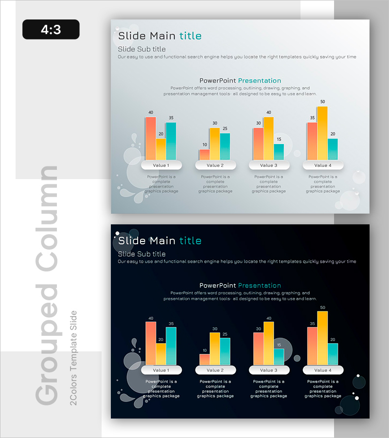
A grouped bar chart PowerPoint slide designed to compare numerical data across four groups with three data series each. The slide uses coral, yellow, and teal color bars to display Values 1 through 4 side by side, enabling quick visual comparison of group performance differences. Perfect for market analysis, competitive benchmarking, departmental performance reviews, and sales presentations. The template includes two design variations: a light background version for standard presentations and a dark navy background for evening events or premium-style decks.
Usage Points
-
Main Usage
The primary goal is to compare numerical values across four distinct groups while displaying three data series per group. The side-by-side bar arrangement makes it easy to identify performance gaps, ranking differences, and trend patterns at a glance. Ideal for presenting market share data, departmental revenue comparisons, competitor performance metrics, and quarterly results.
-
How to Use
Simply replace the Value 1–4 labels and numbers with your own data. The chart is designed to accept direct data input from Excel spreadsheets via copy-paste functionality. Choose the light background slide for standard business presentations or the dark navy background for evening events, formal settings, or premium-themed decks. All bars and labels automatically adjust to reflect your updated values.
-
Recommended For
Marketing managers, sales directors, financial analysts, business intelligence professionals, and executives who regularly present quantitative data. Highly applicable in business plans, quarterly performance reports, market analysis presentations, competitive intelligence briefings, investor pitch decks, and strategic planning sessions.
-
Slide Structure
Two-slide template with identical layouts but different background colors. Each slide displays four groups (Value 1–4) represented by three colored bar series (coral, yellow, teal). Below each group is a text description area for adding context or supporting information. The first slide features a light gray background; the second uses a dark navy background for visual variety and presentation flexibility.
Related Products
-

Bar Chart Visualizing Freight Transport Trends – Essential Market Analysis Tool
#Market and Competitor Analysis #Graph #Text Box
-

Competitiveness Table and Chart Analysis – Market and Competitor Analysis
#Market and Competitor Analysis #Diagram #Graph
-

Four Color Infographic Bar Chart Template – Visualize Your Competitive Advantage
#Market and Competitor Analysis #Graph #Competitor Analysis
-

Vertical Bar Chart for Data Analysis Visualization – Efficiency and Practicality
#Market and Competitor Analysis #Graph #Competitor Analysis
