Visual Summary of Metrics and Key Data Points – Slide for Data Analysis
RB0800027_17
- Last Update 03/23/2025
- File Size 0.4MB
- # of Slides 2
- File Format PPTX
- Slide Ratio 4:3
- Color
Keywords
About the Product
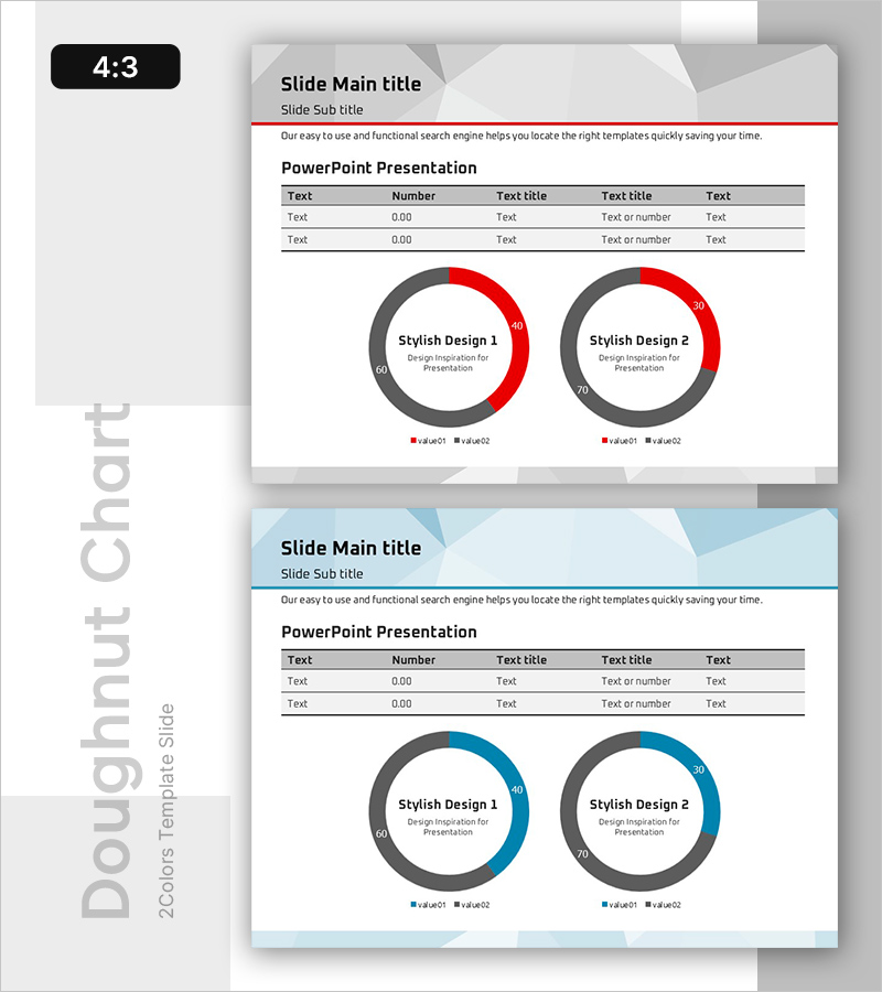
A professional doughnut chart PowerPoint slide designed for data analysis and performance reporting. Two doughnut graphs in red and gray tones visually represent key metrics and data points with dual-series comparison capability. The slide includes a data table at the top for text and numerical information, making it ideal for executive dashboards, quarterly reports, and analytical presentations. Fully editable and ready to use in any business context.
Usage Points
-
Main Usage
Visualize proportional data and compare two metrics simultaneously using dual doughnut charts. Ideal for displaying market share, budget allocation, customer satisfaction scores, revenue distribution, and other ratio-based KPIs in executive presentations.
-
How to Use
Enter item names and values in the data table, then update the doughnut chart data to reflect actual percentages. Use the red segment to highlight primary values and gray for secondary values. Insert directly into business reports, monthly reviews, and management dashboards.
-
Recommended For
Finance teams presenting budget status, marketing teams analyzing channel performance, sales teams tracking goal achievement rates, and executives reporting KPIs. Suitable for any data-driven presentation requiring visual ratio comparison across departments.
-
Slide Structure
2-slide set with 4:3 aspect ratio in PPTX format. Each slide features a header section (title and subtitle), a data table (5 columns × 3 rows for text and numerical input), and two doughnut charts below (each displaying 2-series data with legend). Fully editable in all Microsoft Office versions.
Related Products
-

International Trade Market Analysis Graph – Visualizing Market Trends
#Market and Competitor Analysis #Graph #Future Outlook
-

Donut Chart Visualizing Storage Furniture Sales Status
#Market and Competitor Analysis #Graph #Market Share
-

Pie Chart and Chopa Illustration – Market Analysis Slide
#Market and Competitor Analysis #Financial Plans and Performance #Graph
-

Sales Status by Donut Product Visualization – Attractive Graph Design
#Product/Service Introduction #Market and Competitor Analysis #Graph
