Highlighted Curved Graph for Market Analysis
RB0800020_15
- Last Update 03/21/2025
- File Size 1.3MB
- # of Slides 2
- File Format PPTX
- Slide Ratio 4:3
- Color
Keywords
- #Content-Based Slides
- #Design-Based Slides
- #Market and Competitor Analysis
- #Financial Plans and Performance
- #Graph
- #Market Status
- #Sales and Revenue
- #Line
- #Line Chart
- #4:3
- #line chart PowerPoint
- #dual-series line graph slide
- #trend analysis chart template
- #market analysis PowerPoint slide
- #data visualization presentation
- #how to create line chart in PowerPoint
About the Product
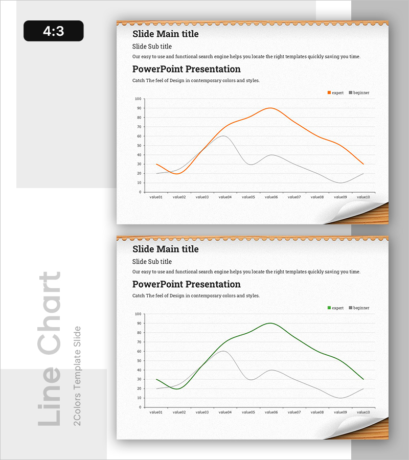
A PowerPoint slide template featuring a dual-series line chart for comparing and analyzing data trends. The orange and gray color scheme clearly distinguishes expert-level and beginner-level performance metrics across 10 data points. This slide deck is ideal for visualizing market conditions, financial performance, sales trends, and other business indicators. Available in 4:3 aspect ratio with 2 slides, ready to integrate into presentations, reports, and analytical documents.
Usage Points
-
Main Usage
Designed to simultaneously display and compare two or more data series over time, enabling trend-based analysis and decision-making. Commonly used for market analysis, financial reporting, sales performance tracking, and customer satisfaction trend monitoring.
-
How to Use
Enter actual numerical values into the 10 data points (value01 through value10) displayed on the slide, and the chart automatically updates. Modify the legend labels 'expert' and 'beginner' to match your report context before presenting.
-
Recommended For
Financial analysts, marketing managers, business planners, and consultants benefit from this template when comparing quarterly or annual performance, conducting competitive benchmarking, and analyzing customer segment trends.
-
Slide Structure
2-slide set: First slide features orange-emphasized series; second slide features green-emphasized series for color variation. Each slide includes title, subtitle, descriptive text area, 10-point dual-series line chart, and legend identifying both data series.
Related Products
-

Fashion Market Sales Status Graph – Data Visualization and Trend Analysis
#Market and Competitor Analysis #Financial Plans and Performance #Graph
-

Newspaper Wide PowerPoint Template Line Chart - Market Analysis and Revenue Performance
#Market and Competitor Analysis #Financial Plans and Performance #Graph
-

Sea Lighthouse Goal Market Strategy Line Graph – Revenue and Profit Growth
#Market and Competitor Analysis #Financial Plans and Performance #Graph
-

Purple Green Flower Market Analysis – Market Status and Competitive Analysis
#Market and Competitor Analysis #Financial Plans and Performance #Graph
