Highlighted Vertical Bar Graph (Green & Orange) – Clear Visualization for Data Comparison
RB0800018_9
- Last Update 03/21/2025
- File Size 0.1MB
- # of Slides 2
- File Format PPTX
- Slide Ratio 4:3
- Color
Keywords
- #Content-Based Slides
- #Design-Based Slides
- #Market and Competitor Analysis
- #Financial Plans and Performance
- #Graph
- #Competitive Advantage
- #Sales and Revenue
- #Column
- #Column Chart
- #4:3
- #vertical bar chart PowerPoint
- #bar graph slide template
- #data comparison chart
- #highlighted bar graph
- #4-item chart slide
About the Product
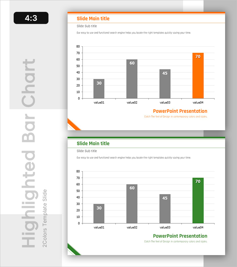
A vertical bar chart PowerPoint slide designed to compare numerical values across four items with clear visual hierarchy. Three gray bars and one orange-highlighted bar emphasize the highest value, making data comparison intuitive and impactful. This 4:3 ratio, 2-slide template is ready for immediate use in market analysis, financial performance reports, and competitive positioning presentations. The clean white background with orange header line creates a professional appearance suitable for business documents and executive presentations.
Usage Points
-
Main Usage
This vertical bar chart is optimized for comparing four numerical values and displaying rankings. The gray and orange two-tone color scheme clearly distinguishes the highlighted item, directing audience attention to key data points. Ideal for presenting market share, sales figures, performance metrics, and other quantitative data with visual clarity.
-
How to Use
Insert this slide into business reports, marketing plans, and financial analysis presentations in the data section. Enter your analysis topic in the title and subtitle areas, then edit the bar heights and numerical labels to match your actual data. The 2-slide format allows you to present multiple comparison datasets in consistent style.
-
Recommended For
Perfect for executive briefings, investor presentations, quarterly performance reviews, and competitive analysis reports. Recommended for finance teams, marketing departments, strategy teams, and any role requiring data-driven decision-making support. Suitable for all business presentations where quantitative evidence needs emphasis.
-
Slide Structure
Four items (value01 through value04) are positioned on the X-axis with a 0-80 range Y-axis scale. The first three items display gray bars (30, 60, 45) while the final item features an orange bar (70) to highlight the maximum value. Orange header line at the top and logo area at the bottom maintain brand consistency across slides.
Related Products
-

India Travel Vertical Bar Graph – Visual Appeal of Green and Red
#Market and Competitor Analysis #Financial Plans and Performance #Graph
-

Ranking of Popularity Vote on the Menu – Visualized with Horizontal Bar Chart
#Market and Competitor Analysis #Financial Plans and Performance #Graph
-

Orange Hexagon Presentation Template Vertical Bar Graph
#Market and Competitor Analysis #Financial Plans and Performance #Graph
-

Car Wide Template Vertical Bar Graph – Market Analysis and Competitive Advantage
#Market and Competitor Analysis #Financial Plans and Performance #Graph
