Free Area Graph Slide (Brown & Green) - Distinct Data Comparison
RB0800018_14
- Last Update 03/21/2025
- File Size 0.1MB
- # of Slides 2
- File Format PPTX
- Slide Ratio 4:3
- Color
Keywords
About the Product
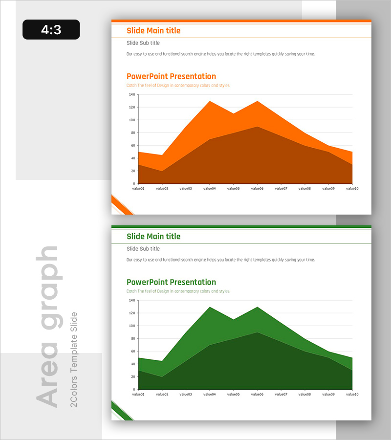
An area graph PowerPoint slide template designed to compare two data series over time with visual clarity. The brown and green color-coded areas represent distinct datasets, allowing viewers to track trends and relationships between metrics at a glance. This 4:3 ratio, 2-slide template is ready to use for business presentations including sales trends, customer growth, market share analysis, and quarterly performance reports. The overlapping area visualization makes it ideal for executive briefings and investor presentations where quantitative comparison is essential.
Usage Points
-
Main Usage
Designed to display and compare two or more data series over time using stacked or overlapping area visualization. Enables audiences to quickly grasp numerical changes in metrics such as revenue, customer count, or market share, while highlighting key trends the presenter wants to emphasize.
-
How to Use
Replace the value01 through value10 axis labels and numbers with your actual data. The brown area represents the first dataset and the green area represents the second; adjust the legend and colors to match your presentation context. The 4:3 aspect ratio ensures compatibility with standard presentation environments.
-
Recommended For
Ideal for financial reports showing revenue and cost trends, marketing plans analyzing customer acquisition, business proposals forecasting market growth, and quarterly or annual performance reviews. Particularly effective for executive briefings and investor presentations requiring side-by-side metric comparison.
-
Slide Structure
Two-slide template with orange header on the first slide and green header on the second. Each slide contains a title area, subtitle, and a 2-series area chart with 10 data points (value01–value10) along the horizontal axis. Overlapping areas clearly show the relationship between the two datasets.
Related Products
-

Medical Donut Circle Graph – Effective Market Analysis
#Market and Competitor Analysis #Graph #Market Analysis
-

Rainbow Presentation Template Infographic Elements – Market Share Analysis
#Business Vision and Strategy #Market and Competitor Analysis #Graph
-

Learning Goal Deflection Line Graph – Business Strategy
#Business Strategy #Market and Competitor Analysis #Graph
-

Salt Farm Production Analysis – Market Situation Visualization
#Market and Competitor Analysis #Graph #Market Status
