Before and After Line Graph for Visualizing Profit Projections – Performance Strategy Presentation
RB0800008-1_9
- Last Update 03/19/2025
- File Size 1.7MB
- # of Slides 2
- File Format PPTX
- Slide Ratio 4:3
- Color
Keywords
About the Product
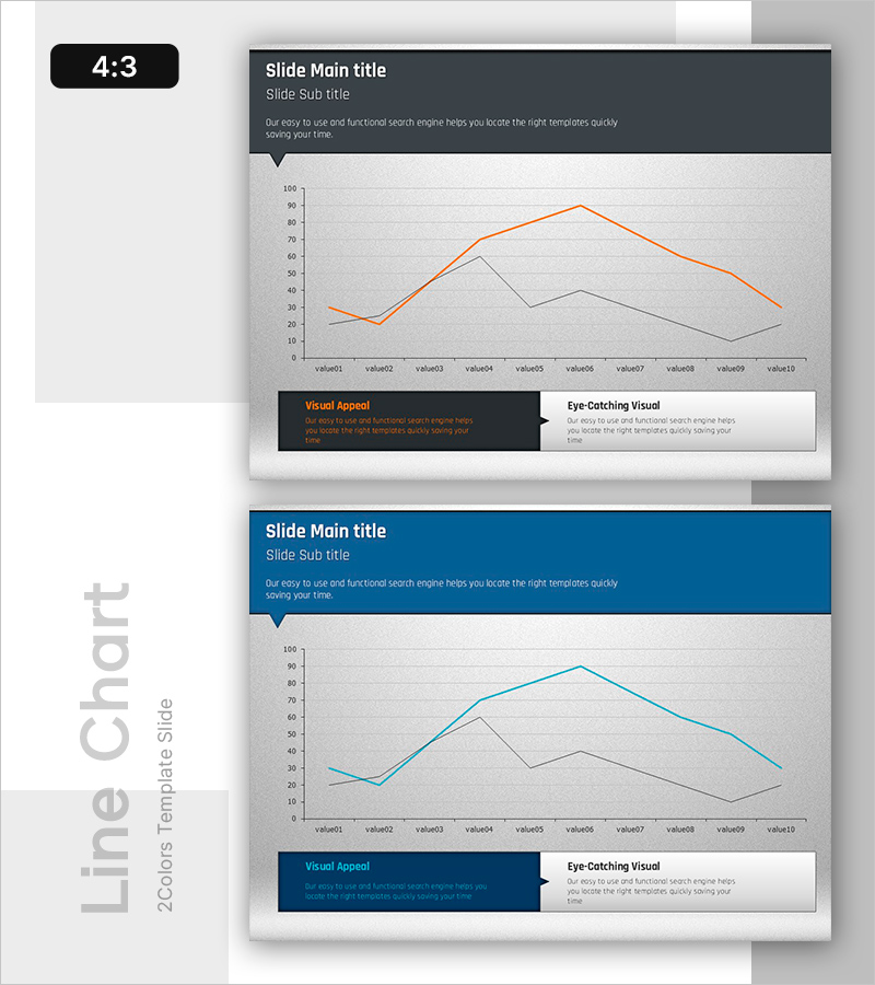
A dual-series line chart PowerPoint slide designed to visualize business performance and revenue projections over time. The slide features an orange line and a gray line representing two contrasting data sets across 10 data points, with a dark gray header section for title and description. This slide effectively communicates performance comparisons, revenue trends, and actual versus target analysis in strategy presentations and business reports. The 4:3 aspect ratio template includes 2 slides ready for immediate customization and use.
Usage Points
-
Main Usage
Designed to compare and analyze two data series over time, such as business performance, revenue forecasts, and actual versus target metrics. This slide is ideal for executive presentations, quarterly performance reviews, and strategic business discussions where clear visualization of trend changes is essential.
-
How to Use
Enter your presentation title and subtitle in the dark gray header area. Customize the graph legend and axis labels to match your data. Assign the orange line to your primary metric (e.g., target revenue) and the gray line to your comparison metric (e.g., actual revenue). Update the bottom text boxes to highlight key insights and findings from the data.
-
Recommended For
Perfect for finance and management teams presenting quarterly earnings, business strategy updates, investor relations meetings, marketing performance analysis, and sales results comparisons. Ideal for executive-level presentations to stakeholders, board members, and senior management who need clear visualization of performance trends.
-
Slide Structure
2-slide set: Slide 1 emphasizes the orange line trend (highlighting growth), Slide 2 emphasizes the gray line trend (highlighting comparative analysis). Each slide features a dark gray header (title, subtitle, description), central chart area (Y-axis 0-100, X-axis with 10 data points), and dual text boxes at the bottom (Visual Appeal and Eye-Catching Visual sections).
Related Products
-

Revenue Growth Target Graph – Effective Performance Presentation
#Business Strategy #Graph #Financial Outlook & Expected Impact
-

Diet Line Chart – Visualizing Business Strategy
#Business Strategy #Graph #Financial Outlook & Expected Impact
-

Geometric Pattern Wide PowerPoint Line Chart – Business Performance Analysis
#Business Strategy #Financial Plans and Performance #Graph
-

Changes in Pet Plant References – Financial Performance Analysis
#Business Strategy #Financial Plans and Performance #Graph
