Blue Radar Chart Analysis – Insights for Products and Services
RB0800002_18
- Last Update 03/17/2025
- File Size 0.1MB
- # of Slides 2
- File Format PPTX
- Slide Ratio 4:3
- Color
Keywords
- #Content-Based Slides
- #Design-Based Slides
- #Product/Service Introduction
- #Graph
- #Features
- #Other
- #Radar Chart Spider Chart
- #4:3
- #radial chart PowerPoint
- #radar chart slide template
- #5-axis analysis diagram
- #product performance comparison
- #multi-dimensional data visualization
- #how to create radar chart in PowerPoint
About the Product
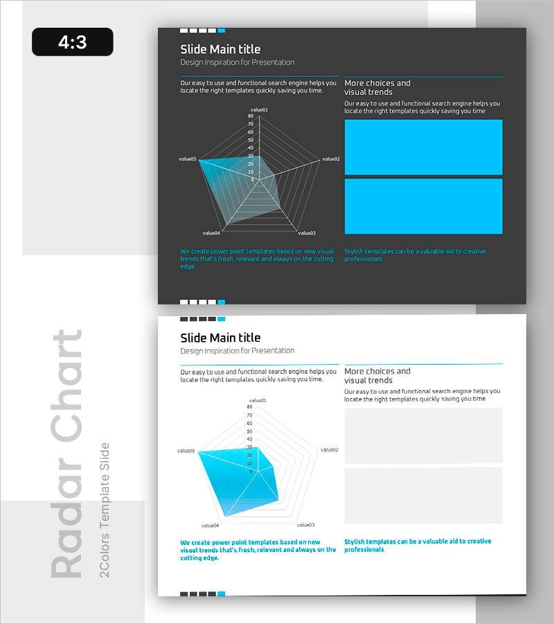
A radial radar chart PowerPoint slide that visualizes five-dimensional data for comprehensive product and service performance analysis. Featuring a dark gray background with cyan blue transparent polygons, this slide enables instant comparison of strengths and weaknesses across multiple metrics. The 2-slide set includes clear numerical axes (0–80) and labeled value points, making it ideal for quantitative presentations. Perfect for competitive benchmarking, performance evaluation, quality assessment, and multi-dimensional data visualization in business pitches, investor presentations, and strategic reports.
Usage Points
-
Main Usage
Visualize and compare five key performance indicators (quality, price, technology, customer satisfaction, reliability, etc.) across products, services, or competitors. The radial format instantly communicates relative strengths and weaknesses, making it ideal for stakeholder presentations, investor pitches, and strategic evaluations.
-
How to Use
Replace value01–value05 labels with your evaluation criteria and input actual data values along the 0–80 axes. Maintain the transparent polygon styling, or add additional data series to compare multiple subjects simultaneously. Customize colors and text as needed while preserving the radial structure.
-
Recommended For
Product managers, marketing professionals, sales presentations, executive reports, investor relations (IR) materials, consulting proposals, performance reviews, and competitive analysis. Ideal for B2B solution pitches, technology comparisons, service quality assessments, and strategic business communications.
-
Slide Structure
2-slide set: Slide 1 features a dark gray background with a 5-axis radial radar chart (cyan blue transparent polygon, 0–80 numerical axes, 5 labeled value points) and right-aligned text area. Slide 2 presents the identical chart structure on a light background for optimal readability in bright environments.
Related Products
-

Fantastic Wide PPT Radar Chart – Visualizing Product Features and Benefits
#Product/Service Introduction #Graph #Product/Service Introduction
-

Two Radial Graphs for Product Feature Comparison – Highlighting Competitive Advantage
#Product/Service Introduction #Market and Competitor Analysis #Graph
-

Sailing Travel Risk Management Radar Chart
#Product/Service Introduction #Business Introduction #Diagram
-

Competency Radar Chart – Business Vision and Strategy Introduction
#Product/Service Introduction #Business Vision and Strategy #Graph
