Highlighting Product Features with Four Radial Graphs
RJ0600057_5
- Last Update 07/06/2025
- File Size 4.7MB
- # of Slides 2
- File Format PPTX
- Slide Ratio 16:9
- Color
Keywords
- #Content-Based Slides
- #Design-Based Slides
- #Product/Service Introduction
- #Graph
- #Features
- #Benefits and Advantages
- #Other
- #Radar Chart Spider Chart
- #16:9
- #radial chart PowerPoint
- #5-axis radar chart template
- #product comparison slide
- #radial diagram presentation
- #how to create radial chart in PowerPoint
About the Product
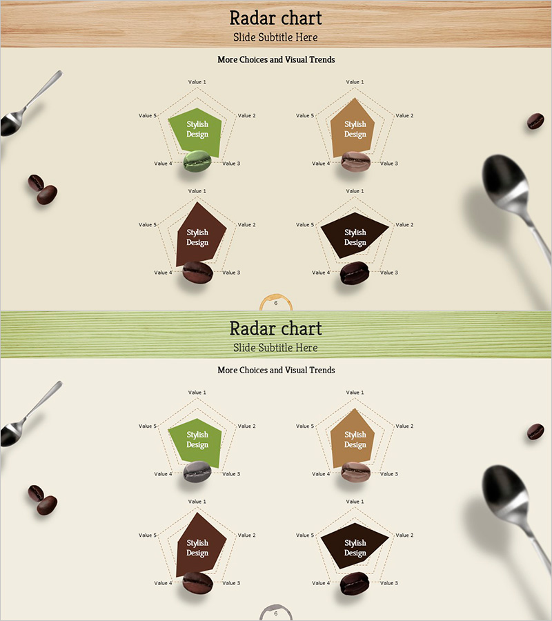
A radial chart PowerPoint slide designed to highlight product features and competitive advantages. Four distinct color schemes—green, brown, wine, and black—display 5-axis radial graphs that enable visual comparison of product benefits and performance metrics. The 2-slide template features identical layouts with multiple radial charts, making it ideal for comparing product lines side-by-side or tracking performance changes over time. Complemented by product mockup imagery, this design elevates presentation professionalism while allowing full customization of axis values and data inputs for diverse business applications.
Usage Points
-
Main Usage
Visualize multiple product or service dimensions—such as performance, quality, price, reliability, and customer satisfaction—across 5 axes to clearly communicate competitive strengths. The radial structure enables intuitive comparison of relative advantages, making it ideal for product launches, marketing pitches, technical briefings, and executive reports where data-driven persuasion is critical.
-
How to Use
Input feature names into the 5 axes (Value 1–5) of each radial graph, then adjust the dotted area size to represent data values. Use the 4 graphs to compare 4 different products, scenarios, or versions, or track performance evolution across time periods. Maintain the existing color palette or customize with brand colors. All axis labels and values are fully editable.
-
Recommended For
Product marketing managers, sales presentations, technical briefings, executive reports, and competitive analysis documents. Particularly effective for software, SaaS, and manufacturing industries requiring multi-dimensional performance comparison and data-driven decision-making support.
-
Slide Structure
2 slides with identical layouts. Each slide contains 4 independent radial charts arranged in a 2×2 grid. Each chart features a central label (Stylish Design) with 5 axes (Value 1–5) connected by dotted lines to define the data area. Product mockup imagery at top and decorative utensil props enhance visual context and professional appearance.
Related Products
-

Food Ingredient Characteristics Radar Chart – Features and Benefits
#Product/Service Introduction #Diagram #Graph
-

Visualizing Features and Benefits with Radial Charts
#Product/Service Introduction #Diagram #Graph
-

Green Purple Radial Chart Analysis – Capturing Visual Strengths
#Product/Service Introduction #Graph #Features
-

Waterproof Interior Material Introduction – Diagram Highlighting Benefits and Features
#Product/Service Introduction #Diagram #Features
