Two Radial Graphs for Product Feature Comparison – Highlighting Competitive Advantage
RJ0900021_12
- Last Update 08/22/2025
- File Size 0.3MB
- # of Slides 2
- File Format PPTX
- Slide Ratio 16:9
- Color
Keywords
- #Content-Based Slides
- #Design-Based Slides
- #Product/Service Introduction
- #Market and Competitor Analysis
- #Graph
- #Features
- #Competitive Advantage
- #Other
- #Radar Chart Spider Chart
- #16:9
- #radial graph PowerPoint slide
- #product comparison chart
- #6-axis radar chart
- #competitive advantage analysis PPT
- #market positioning presentation template
About the Product
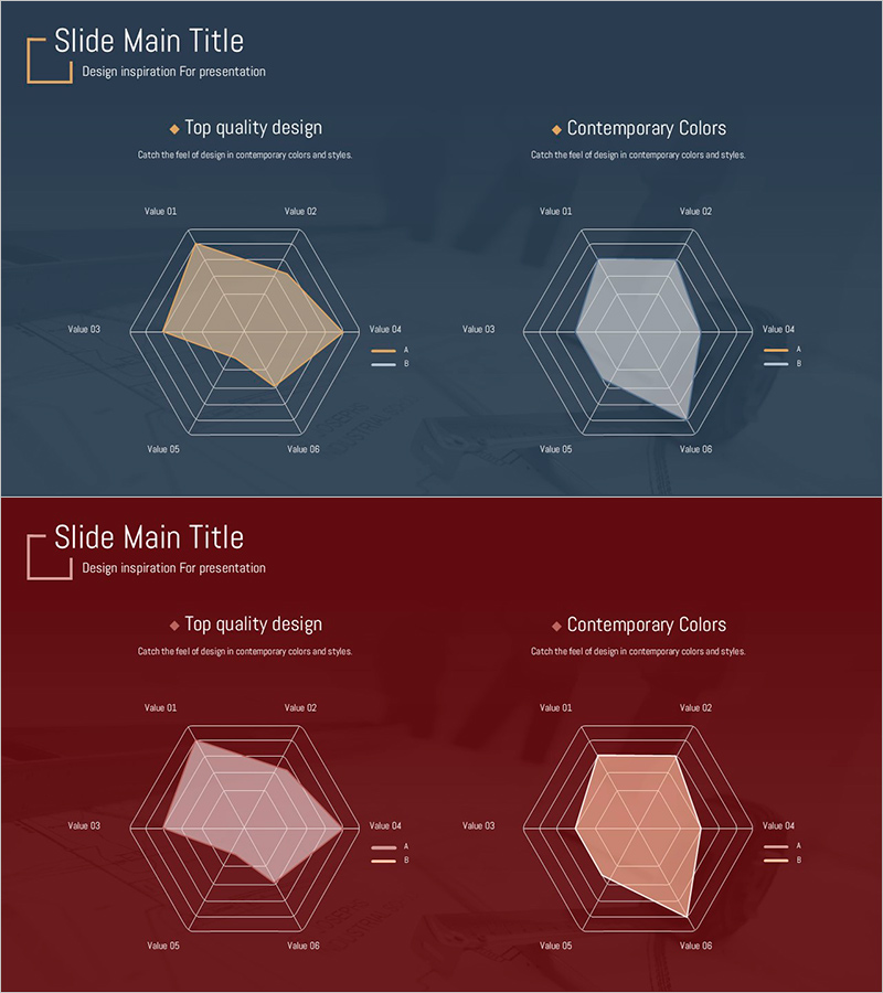
A two-slide PowerPoint set featuring 6-axis radial graphs for comparing product characteristics side by side. The slides use dark blue and wine-red backgrounds with beige and lavender fill areas to visualize two products simultaneously. Each axis is labeled Value 01 through Value 06, allowing you to input performance, price, quality, design, technology, and customer satisfaction metrics. Clear legend indicators distinguish data series for competitive advantage analysis, market positioning, and technical specification presentations. Ready to use for product comparison, competitive analysis, and business development pitches.
Usage Points
-
Main Usage
Compare two products across six dimensions—performance, features, price, design, technology, and customer satisfaction—using radial graphs to visually emphasize competitive advantages and market differentiation.
-
How to Use
Replace Value 01–06 labels with your specific metrics (performance, price, quality, design, technology, customer satisfaction). Input data values into the fill areas and adjust colors to enhance contrast between the two product series.
-
Recommended For
Product management teams presenting competitive analysis, sales teams introducing products, marketing teams reporting market positioning, and technical teams explaining specification comparisons.
-
Slide Structure
Two 6-axis radial graphs on separate slides (dark blue background and wine-red background). Each slide displays beige-filled data on the left and lavender-filled data on the right for direct product comparison. Axis labels and legend provide clear data entry structure.
Related Products
-

Comparable Filled Radial Chart – Intuitive Data Analysis
#Product/Service Introduction #Market and Competitor Analysis #Diagram
-

Product Comparison Radar Chart – Competitive Advantage Analysis
#Product/Service Introduction #Market and Competitor Analysis #Graph
-

Competency Radar Chart – Business Vision and Strategy Introduction
#Product/Service Introduction #Business Vision and Strategy #Graph
-

Introducing Product Features with Advanced Radar Chart
#Product/Service Introduction #Graph #Features
