Renewable Energy Bar Graph – Performance and Strategy
RJ0600067_7
- Last Update 07/08/2025
- File Size 2.1MB
- # of Slides 2
- File Format PPTX
- Slide Ratio 16:9
- Color
Keywords
- #Content-Based Slides
- #Design-Based Slides
- #Business Strategy
- #Financial Plans and Performance
- #Graph
- #Achievements
- #Sales and Revenue
- #Column
- #Column Chart
- #16:9
- #diverging column chart PowerPoint
- #stacked bar graph presentation
- #renewable energy slide template
- #performance comparison chart
- #data visualization PPT
- #how to create diverging chart in PowerPoint
About the Product
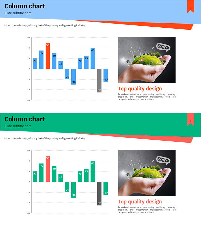
A diverging column chart PowerPoint slide designed to visualize renewable energy project performance and strategy with contrasting positive and negative data. The slide uses blue and red color schemes to clearly distinguish between opposing metrics, with numerical labels displayed on each bar for precise value comparison. Optimized for 16:9 widescreen format in a 2-slide set, this presentation template is ready to use for financial performance reports, business strategy presentations, environmental policy briefings, and comparative analysis decks. Bar colors and data values are fully editable, allowing you to adapt the chart for multiple industries and analytical scenarios.
Usage Points
-
Main Usage
Display renewable energy project metrics by comparing positive and negative data simultaneously, enabling stakeholders to assess performance and challenges at a glance. The diverging structure effectively visualizes contrasting indicators such as target vs. actual results, planned vs. executed outcomes, and growth vs. decline metrics.
-
How to Use
Integrate into financial performance reports for profitability analysis sections, business strategy presentations for performance evaluation slides, and environmental policy briefings for energy efficiency comparisons. Customize bar heights and colors to match your data, then repurpose the template for comparative analysis across various industries and sectors.
-
Recommended For
Finance teams presenting quarterly and annual performance reports, business development teams showcasing project progress, environmental and energy departments explaining policy initiatives, consulting firms delivering client analysis reports, and academic presenters comparing research data.
-
Slide Structure
A 2-slide set featuring diverging column charts with blue bars (positive values) and red bars (negative values) arranged symmetrically above and below a horizontal axis. Each slide displays approximately 8–10 data points with numerical labels positioned on the bars, enabling precise value comparison and clear data interpretation.
Related Products
-

Vertical General Bar Chart – Clear Performance Analysis
#Business Strategy #Financial Plans and Performance #Graph
-

Visualization of Major Sales Growth Segments – Performance and Strategy
#Business Strategy #Financial Plans and Performance #Graph
-

Breaking Sales Records – Visualizing Performance
#Business Strategy #Financial Plans and Performance #Graph
-

Square Frame Template Column Chart – Business Performance Report
#Business Strategy #Financial Plans and Performance #Graph
