Blue Donut Chart – Effective Data Visualization
RB0800001_14
- Last Update 03/17/2025
- File Size 0.5MB
- # of Slides 2
- File Format PPTX
- Slide Ratio 4:3
- Color
Keywords
About the Product
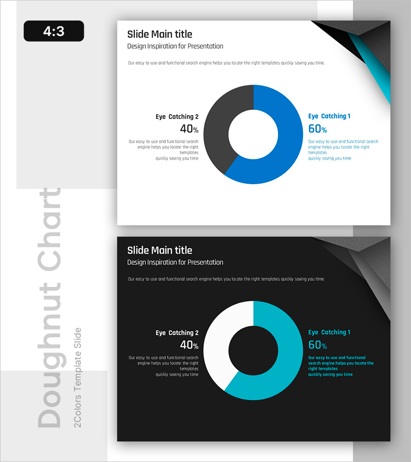
A professional donut chart PowerPoint slide designed to visualize the proportion of two data categories with clarity and impact. The chart features a teal (60%) and charcoal (40%) two-color donut format, ideal for comparing data segments and displaying composition ratios. Presented in 4:3 aspect ratio across 2 slides with both light and dark background layouts, each including labeled sections and descriptive text areas. Ready to use immediately in presentations, reports, and analytical materials where key metrics need visual emphasis.
Usage Points
-
Main Usage
Compare and display the proportion, composition, and market share of two data categories at a glance. Clearly illustrate the relationship between whole and parts to enhance audience comprehension. Ideal for emphasizing key metrics in reports, analytical presentations, and marketing pitches.
-
How to Use
Edit the percentage values and labels in each donut segment to match your data. Use the light background slide for daytime presentations and projector environments; the dark background works best for evening presentations and large displays. Add insights and interpretations in the text area to strengthen data credibility and narrative flow.
-
Recommended For
Finance and marketing report creators, market analysts, business performance presenters, and customer satisfaction researchers. Particularly suited for comparing two-category scenarios: success vs. failure rates, new vs. existing customers, online vs. offline revenue, or any binary data split requiring visual comparison.
-
Slide Structure
2-slide set. Slide 1: Light background (white/gray) with teal 60% / charcoal 40% donut chart, labels on left, descriptive text on right. Slide 2: Black background with identical donut chart, teal color emphasis maintained, white text treatment. Both slides feature geometric accent elements (black and teal triangles) in upper right corner.
Related Products
-

Baby and Toddler Products Business Market Graph
#Market and Competitor Analysis #Graph #Competitor Analysis
-

Health Checkup Data Analysis Circular Graph – Effective Business Data Visualization
#Product/Service Introduction #Market and Competitor Analysis #Diagram
-

Survey Graph on the Background of the Sea – Market Analysis & Competitive Edge
#Market and Competitor Analysis #Diagram #Graph
-

Business Forest Wide Template Diagram7 – A Visual Tool for Success
#Company Introduction #Product/Service Introduction #Graph
