Visualizing Market Analysis with Line Chart – Harmony of Mint and Orange
RJ0500030_16
- Last Update 06/15/2025
- File Size 0.1MB
- # of Slides 2
- File Format PPTX
- Slide Ratio 16:9
- Color
Keywords
- #Content-Based Slides
- #Design-Based Slides
- #Market and Competitor Analysis
- #Diagram
- #Graph
- #Competitor Analysis
- #Competitive Advantage
- #Table
- #Line
- #Standard Table
- #Line Chart
- #16:9
- #line chart PowerPoint
- #market analysis presentation slide
- #data trend visualization
- #competitive analysis template
- #3-series line graph slide design
About the Product
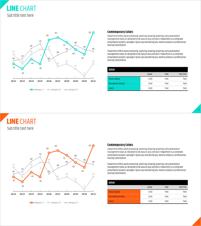
A professional line chart PowerPoint slide designed for market analysis and competitive comparison. This presentation template visualizes 10 years of data trends from 2022 to 2031 across three data series, using a mint and orange color scheme to clearly distinguish primary and secondary indicators. Each data point is labeled with precise numerical values for accurate comparison, and a summary table based on 2016 data is positioned on the right side to enhance the presentation's completeness. Formatted in 16:9 widescreen ratio with 2 fully editable slides, allowing you to adapt the template to your own data and use it immediately for professional presentations.
Usage Points
-
Main Usage
Visualizes numerical changes over time such as market analysis, competitive benchmarking, sales trends, and customer satisfaction evolution. The three-line design enables simultaneous comparison of multiple indicators, making it ideal for business reports, investor presentations, and marketing strategy documents.
-
How to Use
Open the slide and replace existing data points and labels with your own figures. Series colors can be retained or adjusted as needed, and the table items and values on the right are fully editable. During presentation, first explain the meaning of each series, then emphasize key inflection points and trends to enhance audience comprehension.
-
Recommended For
Finance managers, marketing strategists, business development professionals, consultants, and investor relations specialists benefit from this template for presenting market conditions, competitive analysis, and performance reports. It is particularly effective for quarterly and annual results presentations, new business proposals, and investor pitch decks.
-
Slide Structure
Each slide features a 3-series line chart on the left (X-axis: 2022–2031, Y-axis: 0–95 scale) with a summary table on the right labeled '2016' containing three data rows. Mint accent lines, gray supporting lines, and orange accent lines create visual hierarchy, with numerical labels at every data point for precise comparison.
Related Products
-

Competitor Analysis Graph & Table by Year
#Market and Competitor Analysis #Diagram #Graph
-

Competitor Comparison Graph & Table - Essential Tool for Market Analysis
#Market and Competitor Analysis #Diagram #Competitor Analysis
-

Comparison Graph of Yearly Trends – Market and Competitor Analysis
#Market and Competitor Analysis #Diagram #Graph
-

Dawn City Theme Competitor Analysis Graph – Understanding Market Trends
#Market and Competitor Analysis #Diagram #Graph
