Sugar Content Analysis Bar Graph Table
RJ0400034_7
- Last Update 05/26/2025
- File Size 2.3MB
- # of Slides 2
- File Format PPTX
- Slide Ratio 16:9
- Color
Keywords
- #Content-Based Slides
- #Design-Based Slides
- #Market and Competitor Analysis
- #Diagram
- #Graph
- #Competitor Analysis
- #Market Analysis
- #Table
- #Horizontal Bar
- #Standard Table
- #Horizontal Bar Chart
- #16:9
- #horizontal bar chart PowerPoint
- #bar graph slide template
- #data comparison chart
- #sugar content analysis PPT
- #numerical comparison presentation
About the Product
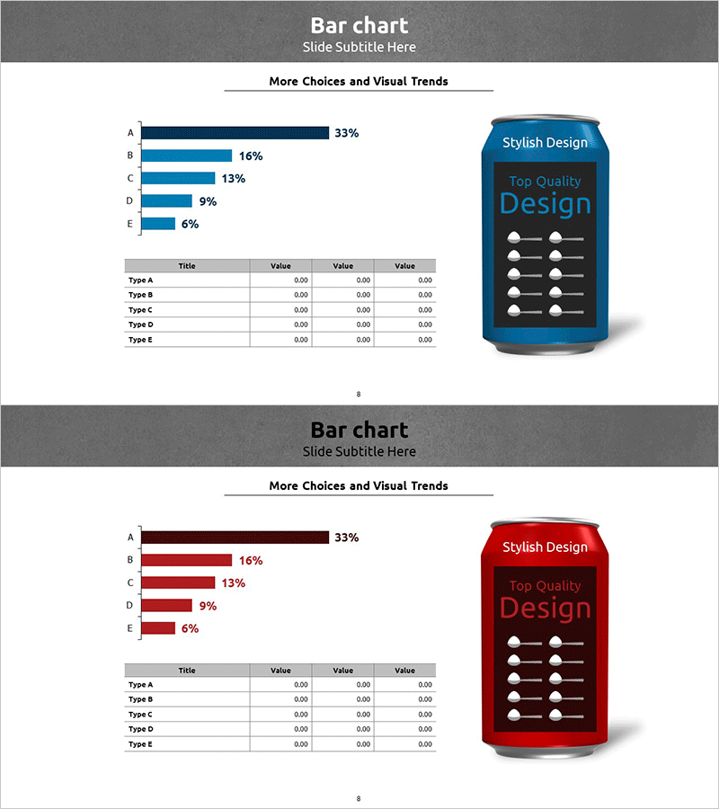
A horizontal bar chart PowerPoint slide designed for sugar content analysis and comparative data visualization. The slide features five items (A through E) displayed as percentage-based horizontal bars in dark blue, paired with a detailed data table below. A gray background and stylish design element on the right enhance data readability and visual appeal. Delivered as a 2-slide PPTX file in 16:9 aspect ratio, fully editable and ready for market analysis, competitive benchmarking, and product comparison presentations.
Usage Points
-
Main Usage
Ideal for visualizing product ingredient analysis, market data comparisons, and competitive benchmarking results. The five-item horizontal bar chart clearly displays percentage-based comparisons, while the data table below provides detailed numerical values for comprehensive analysis.
-
How to Use
Edit the bar chart values and colors to match your dataset, then populate the table with specific item names and corresponding figures. Insert into presentation sections for analysis, reports, or proposals to strengthen data credibility and audience understanding.
-
Recommended For
Marketing professionals in food and beverage industries, market research analysts, product development teams, and sales proposal specialists conducting competitive product analysis or ingredient comparison presentations. Also suitable for academic presentations and policy reports.
-
Slide Structure
Slide 1: Dark header with title + five horizontal bars (A 33%, B 16%, C 13%, D 9%, E 6%) in dark blue + stylish design element on right side. Slide 2: Identical layout with red color scheme. Both slides include a 5-row by 3-column data table at the bottom.
Related Products
-

Cement Theme Bar Graph & Table
#Market and Competitor Analysis #Diagram #Graph
-

Stylish Bar Chart Slide Design
#Market and Competitor Analysis #Diagram #Graph
-

Blue Green Horizontal Bar Graph – Optimized for Market and Competitive Analysis
#Market and Competitor Analysis #Diagram #Graph
-

Competitor and Customer Analysis Horizontal Bar Graph and Table
#Market and Competitor Analysis #Diagram #Graph
