Triangle Pattern PPT Table Chart – Visualizing Financial Performance
RB0700030_6
- Last Update 03/17/2025
- File Size 4.8MB
- # of Slides 2
- File Format PPTX
- Slide Ratio 4:3
- Color
Keywords
- #Content-Based Slides
- #Design-Based Slides
- #Financial Plans and Performance
- #Diagram
- #Balance Sheet
- #Key Financial Indicators
- #Table
- #Standard Table
- #4:3
- #table PowerPoint slide
- #data comparison presentation
- #3-row table template
- #financial performance chart
- #information organization PPT
- #table chart PowerPoint
About the Product
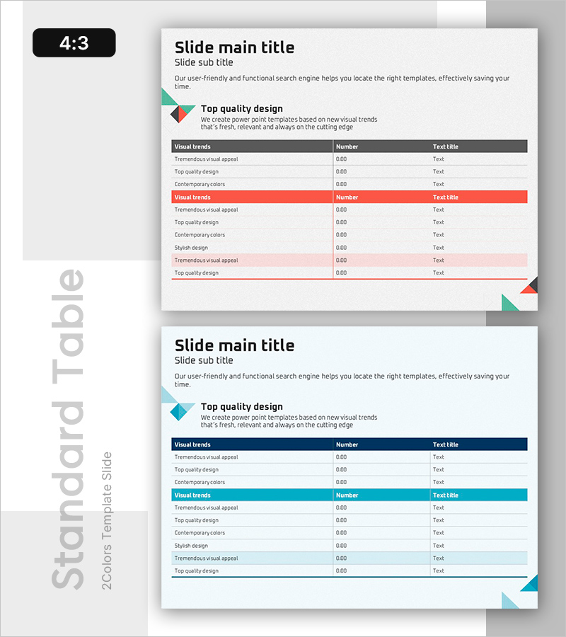
A three-column table PowerPoint slide designed to organize financial performance and visual trends with clarity. The data table features three distinct header rows in gray, red, and blue, enabling effective item-by-item numerical comparison and text information display. Each row represents an independent category, with evenly distributed number and text input fields for immediate use in financial planning, performance analysis, and market research reporting. The 4:3 aspect ratio with 2-slide composition allows flexible arrangement to match your presentation flow.
Usage Points
-
Main Usage
Optimized for comparing quantitative information such as financial results, market data, and project status by organizing content into row-based categories. The independent header colors (gray, red, blue) in each row provide intuitive category distinction, enabling audiences to grasp information rapidly.
-
How to Use
Edit header text and data cells in each row to match your presentation content. Freely input numbers, percentages, and text; use color headers for category separation or importance indication. The 2-slide composition supports continuous comparative analysis slide arrangement.
-
Recommended For
Recommended for finance teams presenting quarterly performance reports, marketing teams comparing channel performance, operations teams tracking project progress, and sales teams organizing customer portfolios. Particularly effective for executive briefings and board materials requiring data-driven decision-making.
-
Slide Structure
Structured as a three-column table with alternating gray, red, and blue headers for each row. Header rows contain category names, while lower rows provide number and text input fields. The 2-slide format maintains identical structure to support continuous data representation.
Related Products
-

Green Brown Statistics Table – Financial Performance Analysis
#Financial Plans and Performance #Diagram #Balance Sheet
-

Modern Blue Table Chart Presentation Template
#Financial Plans and Performance #Diagram #Balance Sheet
-

Visualizing Financial Performance with Comparison Tables – Transparent Information Delivery
#Financial Plans and Performance #Diagram #Balance Sheet
-

Organize Financial Plans with Abstract Pattern Template
#Financial Plans and Performance #Diagram #Balance Sheet
