Analysis Table of Korean Culture – An Effective Data Visualization Tool
RJ0800030_18
- Last Update 08/08/2025
- File Size 5.7MB
- # of Slides 2
- File Format PPTX
- Slide Ratio 16:9
- Color
Keywords
- #Content-Based Slides
- #Design-Based Slides
- #Financial Plans and Performance
- #Diagram
- #Balance Sheet
- #Key Financial Indicators
- #Table
- #Standard Table
- #16:9
- #table PowerPoint slide
- #analysis table template
- #data comparison slide
- #Korean culture analysis PPT
- #6-column table slide
- #data visualization presentation
About the Product
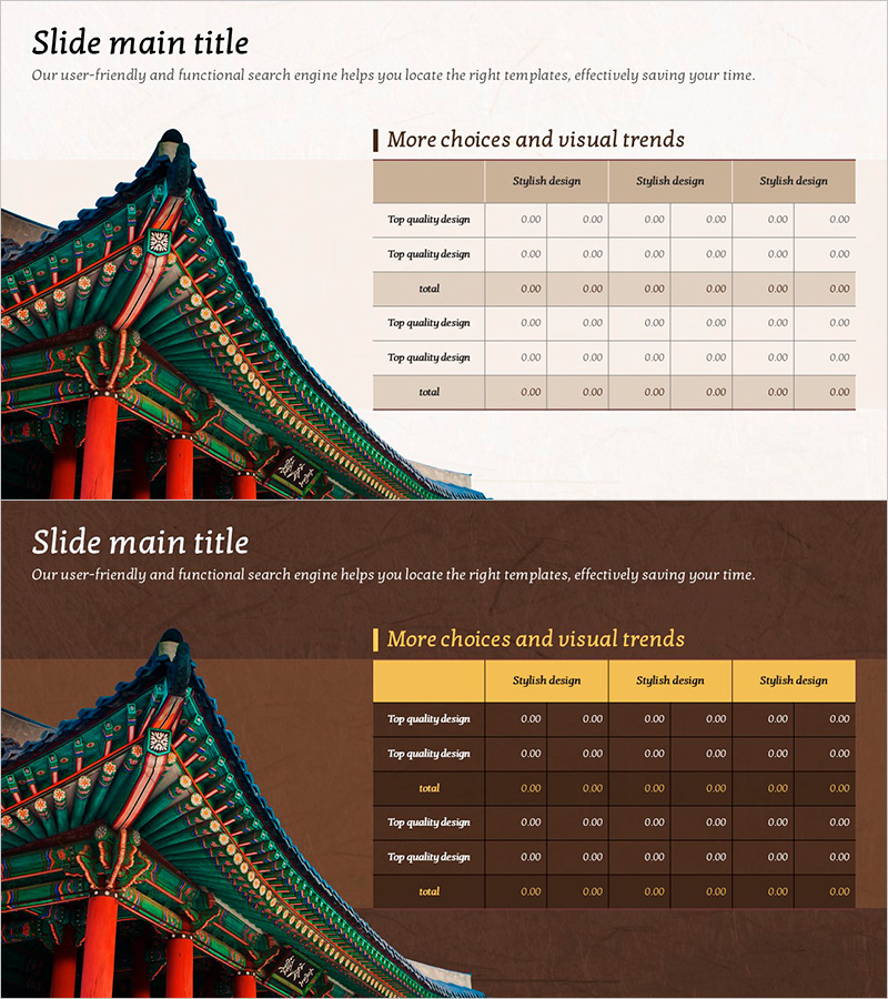
A 6-column table PowerPoint slide designed to effectively analyze and compare Korean cultural topics. The slide features a beige and brown-toned background with clear row and column divisions for systematic data organization. Multiple rows allow for comprehensive information presentation, making complex data easy to understand at a glance. This 2-slide set is optimized for 16:9 widescreen format and ready to use immediately in cultural presentations, research reports, market analysis, and educational seminars.
Usage Points
-
Main Usage
A data organization tool for comparing and visualizing various aspects of Korean culture. Ideal for cultural research, tourism marketing, educational materials, and business reports where complex information needs to be presented in a clear tabular format.
-
How to Use
Enter analysis items and data into the 6-column table cells. Add category names in the header row and fill in comparison subjects, numerical values, and descriptions in subsequent rows. Customize by adding rows or adjusting column widths as needed for your specific data.
-
Recommended For
Cultural researchers, tourism and marketing professionals, educators, business analysts, and consultants presenting Korean cultural data. Suitable for academic presentations, corporate reports, educational seminars, and professional business meetings.
-
Slide Structure
2-slide set with each slide containing a 6-column × multi-row table structure. Title and description text areas appear at the top, while the beige and brown-toned header row and data entry rows are positioned below. Clear line divisions distinguish each cell, creating an intuitive information hierarchy.
Related Products
-

Modern Blue Table Chart Presentation Template
#Financial Plans and Performance #Diagram #Balance Sheet
-

Origami Concept Table – Visualizing Financial Performance
#Financial Plans and Performance #Diagram #Balance Sheet
-

Visualizing Financial Performance with Comparison Tables – Transparent Information Delivery
#Financial Plans and Performance #Diagram #Balance Sheet
-

Triangle Pattern PPT Table Chart – Visualizing Financial Performance
#Financial Plans and Performance #Diagram #Balance Sheet
