Comparison of Infection Risk Using Pie Charts
RB0400014_6
- Last Update 03/12/2025
- File Size 1.7MB
- # of Slides 2
- File Format PPTX
- Slide Ratio 4:3
- Color
Keywords
- #Content-Based Slides
- #Design-Based Slides
- #Market and Competitor Analysis
- #Risk Management and Regulatory Compliance
- #Graph
- #Competitive Advantage
- # Risk Management Strategy
- #Circles
- #Pie Chart
- #4:3
- #pie chart PowerPoint slide
- #pie graph template
- #comparison analysis slide
- #data visualization PPT
- #dual chart presentation
About the Product
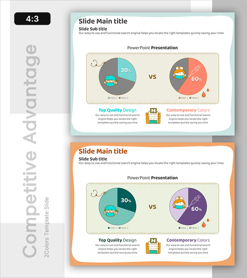
A PowerPoint slide featuring two pie charts for comparative data analysis, ideal for presenting infection risk levels or market comparisons. The design uses a cohesive color palette of gray, teal, and coral tones, with each chart highlighting key percentages such as 30% and 60%. Illustrated characters and icons enhance data comprehension, while text areas below provide space for additional insights. This presentation slide is ready to use for risk management, competitive analysis, and market research scenarios requiring quantitative comparison.
Usage Points
-
Main Usage
Simultaneously compare two datasets using pie charts to clearly visualize differences and proportions. Effectively communicate ratio-based information such as infection risk levels, market share, or customer satisfaction metrics.
-
How to Use
Input different data into the left and right pie charts, then edit the legend and numerical values to match your presentation context. Add analysis results or key insights in the text areas below to strengthen data interpretation.
-
Recommended For
Recommended for presentations requiring quantitative comparison in risk management, competitive analysis, market research, product comparison, and customer analysis. Enhances data credibility in executive reports, marketing plans, and business analysis documents.
-
Slide Structure
Two-slide layout. Each slide contains a title and subtitle area, two pie charts in the center (left in gray and teal tones, right in gray and coral tones), legends, and two text boxes at the bottom. Formatted in 4:3 aspect ratio for consistent display across all screens.
Related Products
-

Pie Chart Visualizing Coffee Ingredients Ratio - Market Share Analysis
#Market and Competitor Analysis #Graph #Market Share
-

Comparison Pie Chart by Subject – Emphasizing Competitive Advantage
#Market and Competitor Analysis #Graph #Competitor Analysis
-

Drone Performance Comparison Analysis Graph – Data Visualization
#Product/Service Introduction #Market and Competitor Analysis #Graph
-

Camping Isometric Business Competitor Pie Chart Analysis
#Market and Competitor Analysis #Graph #Competitor Analysis
