Summary Table of Experimental Data – Precise Information Delivery
RB0400009_4
- Last Update 03/12/2025
- File Size 0.4MB
- # of Slides 2
- File Format PPTX
- Slide Ratio 4:3
- Color
Keywords
- #Content-Based Slides
- #Design-Based Slides
- #Business Strategy
- #Technical Approach
- #Diagram
- #Achievements
- #Research and Development
- #Table
- #Standard Table
- #4:3
- #data summary table PowerPoint
- #table slide template
- #information organization presentation
- #numerical data chart
- #report table slide design
- #how to create data table in PowerPoint
About the Product
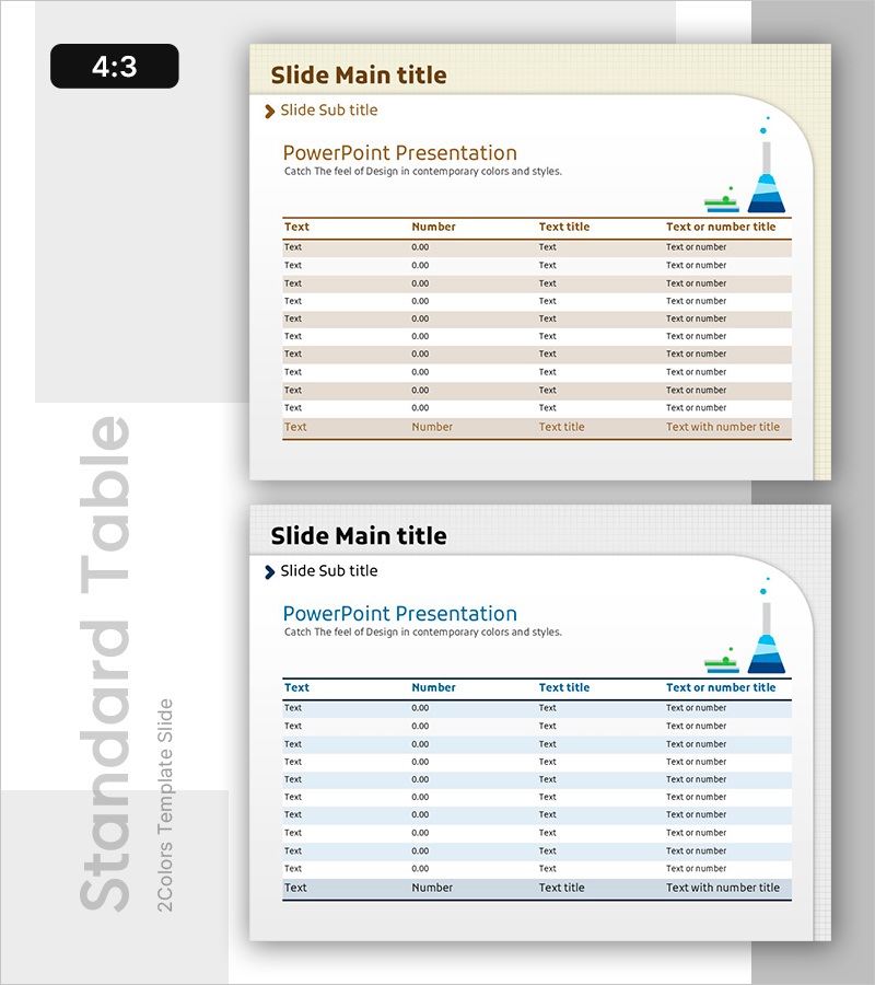
A table-format PowerPoint slide for organizing experimental data and numerical information systematically. Designed with a beige background, brown header row, and gray striped data rows to enhance data readability. The slide features 4 columns (Text, Number, Text title, Text or number title) and 10 data rows, with a pyramid icon on the right side to visualize information hierarchy. Ideal for reports, analysis presentations, and performance summaries where quantitative data needs clear delivery in PowerPoint slides.
Usage Points
-
Main Usage
Organize and present quantitative information such as experimental results, survey data, and performance metrics in table format. Clear row and column separation facilitates data comparison and analysis, while header emphasis highlights information hierarchy.
-
How to Use
Use in reports, analysis presentations, and performance evaluation materials when presenting quantitative data in table form. Input actual data into Text, Number, and Title columns, and customize by adding rows or changing colors for emphasis as needed.
-
Recommended For
Researchers, data analysts, project managers, and marketing professionals presenting experimental results, market research, sales performance, and budget status. Suitable for academic presentations, corporate reports, and policy proposals requiring credible information delivery.
-
Slide Structure
Structured with 4 columns (Text, Number, Title, Text or number) and 10 data rows. The header row is highlighted in brown, while data rows alternate with gray stripes for easy row tracking. A pyramid-shaped icon is positioned in the upper right to represent data hierarchy.
Related Products
-

Changes in Sales and Future Outlook – Supporting Business Strategy
#Business Strategy #Financial Plans and Performance #Diagram
-

KPI Target vs Actual Slide – 4-Metric Dark Red & Purple
#Company Introduction #Business Strategy #Financial Plans and Performance
-

Numerical Summary of Drug Component Experiments - Based on Innovative Technology
#Business Strategy #Technical Approach #Diagram
-

Eco-friendly Indicator Table – Sustainable Business Strategy
#Business Strategy #Business Management #Diagram
