Bar Graph of Favorite Subjects – Data Visualization
RB0300038_5
- Last Update 03/11/2025
- File Size 0.7MB
- # of Slides 2
- File Format PPTX
- Slide Ratio 4:3
- Color
Keywords
- #Content-Based Slides
- #Design-Based Slides
- #Market and Competitor Analysis
- #Graph
- #Customer Analysis
- #Market Analysis
- #Column
- #Column Chart
- #4:3
- #bar chart PowerPoint slide
- #6-item comparison chart
- #data visualization template
- #vertical bar graph
- #statistical analysis presentation
- #preference analysis slide template
About the Product
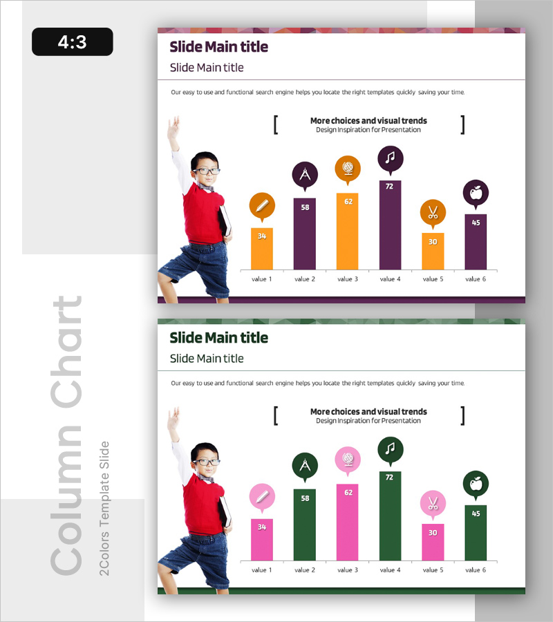
A vertical bar chart PowerPoint slide designed for analyzing student subject preferences and comparative data visualization. The slide features six data bars in orange and purple two-tone colors, each topped with a circular icon badge for category identification. The chart clearly displays numerical values (ranging from 30 to 72) for easy comparison across all six items. This presentation template is ready to use for educational reports, market research, and statistical analysis presentations. The 4:3 aspect ratio with 2-slide layout ensures compatibility with standard presentation formats.
Usage Points
-
Main Usage
Visualize and compare numerical data across six categories such as student preferences, market survey results, satisfaction ratings, or performance metrics. The vertical bar format makes it easy to identify rankings and numerical differences at a glance, ideal for educational institutions, marketing teams, and research organizations.
-
How to Use
Open the slide and replace the bar heights and numerical values with your own data. Customize the circular icon badges with your category names and adjust colors as needed. During presentation, emphasize the ranking order and numerical differences between items to enhance audience understanding.
-
Recommended For
Educational institutions conducting student preference surveys, marketing teams analyzing consumer satisfaction, research organizations presenting statistical reports, corporate training seminars, academic thesis presentations, and policy proposal documents.
-
Slide Structure
Two-slide layout with identical structure: first slide features orange and purple two-tone bars with values (34, 58, 62, 72, 30, 45), second slide uses pink and green two-tone bars. Each bar is topped with a circular icon badge positioned above the data value for visual category identification.
Related Products
-

Consumer Insights & Behavioral Patterns Analysis Slide
#Market and Competitor Analysis #Graph #Market Status
-

Market Sales and Profit Analysis with Bar Chart – Analysis and Insights
#Market and Competitor Analysis #Financial Plans and Performance #Graph
-

User Analysis Results Diagram - Infographic for Customer Insights
#Market and Competitor Analysis #Graph #Other
-

Gender Wage Gap Analysis Graph – Insights for Market Analysis
#Market and Competitor Analysis #Graph #Customer Analysis
