Market Trends and Analysis Green Navy – Clearly Displaying Market Trends
RJ0400014_13
- Last Update 05/21/2025
- File Size 0.2MB
- # of Slides 2
- File Format PPTX
- Slide Ratio 16:9
- Color
Keywords
About the Product
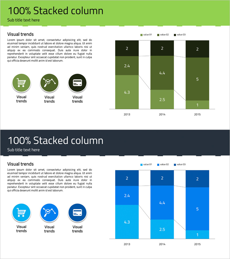
A professional 100% stacked column chart PowerPoint slide designed to clearly display market analysis and trends across multiple data series. The slide features three data series visualized in green and navy blue gradient tones, comparing year-over-year changes from 2013 to 2015. Each column displays precise numerical labels for easy data interpretation during presentations. The left side includes three icon placeholders with descriptive text areas to highlight key market insights. Created in 16:9 widescreen format and fully editable PPTX file, allowing you to customize all elements including data values, colors, and text content for your specific business needs.
Usage Points
-
Main Usage
Ideal for visualizing multiple data series across time periods, such as market share evolution, sales composition by category, revenue breakdown by region, or growth rate comparisons. The stacked format simultaneously shows total magnitude and individual series proportions, making it essential for executive reports, business plans, and marketing strategy presentations.
-
How to Use
Enter your key insights or analysis points in the left icon area, then replace the chart data with your own figures. Maintain the color scheme while editing column heights and numerical labels to reflect actual data. Adjust text size and font as needed for optimal readability during presentations. All elements are fully editable within PowerPoint.
-
Recommended For
Executives, marketing managers, business analysts, consultants, and financial professionals presenting quarterly or annual performance comparisons, market size evolution, customer segment analysis, or revenue composition breakdowns. Particularly effective when comparing three or more data categories simultaneously.
-
Slide Structure
Two-slide set, each featuring a left section with three icon placeholders and descriptive text area, paired with a right-side 100% stacked column chart. The chart displays three data series (value01, value02, value03) in green, medium-green, and navy blue, covering three years (2013-2015). Numerical labels are clearly marked within each column segment for precise data communication.
Related Products
-

Analysis of 3D Printing Progress – Market Trends and Insights
#Market and Competitor Analysis #Graph #Market Analysis
-

Vertical Bar Chart for Learning Outcomes Comparison - Market Share Visualization
#Market and Competitor Analysis #Graph #Market Analysis
-

Pork Consumption Stack Chart – Market Trend Analysis
#Market and Competitor Analysis #Graph #Market Analysis
-

Stereographic Segmentation Bar Chart – Visualization of Market Analysis and Trends
#Market and Competitor Analysis #Graph #Market Analysis
