Heavy Equipment Work Comparison Chart – The Start of Logistics Innovation
RB0100017_4
- Last Update 03/02/2025
- File Size 0.8MB
- # of Slides 2
- File Format PPTX
- Slide Ratio 4:3
- Color
Keywords
- #Content-Based Slides
- #Design-Based Slides
- #Product/Service Introduction
- #Market and Competitor Analysis
- #Graph
- #Development Status
- #Competitive Advantage
- #Column
- #Grouped Column
- #4:3
- #grouped bar chart PowerPoint
- #horizontal vertical bar graph slide
- #5-item comparison chart
- #data visualization template
- #equipment work analysis slide
About the Product
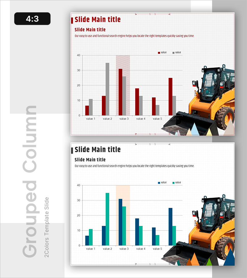
A 2-slide grouped bar chart PowerPoint template designed for comparing heavy equipment work items across categories. This presentation slide set features both horizontal and vertical bar chart layouts to visualize dual-series numerical data for five items, enabling clear ranking and comparative analysis. The dark red and gray color scheme conveys professionalism, while the dual-axis data representation ensures accurate information delivery. Ideal for construction, logistics, and manufacturing industry presentations covering performance comparisons, market analysis, and operational reports.
Usage Points
-
Main Usage
This slide set visualizes dual-series numerical data for five items using both horizontal and vertical bar chart formats. It is designed for comparing heavy equipment performance metrics, departmental results, regional sales figures, product line performance, and other quantitative data requiring side-by-side analysis.
-
How to Use
The first slide presents a dark red horizontal bar chart emphasizing item-to-item numerical comparison, while the second slide uses a teal vertical bar chart to highlight trends and changes. Edit the legend, axis labels, and data values on each slide to match your specific presentation content and organizational data.
-
Recommended For
Executives, project managers, and sales professionals in construction, heavy equipment, logistics, and manufacturing sectors. Suitable for quarterly performance reports, market analysis presentations, competitive comparisons, and operational status updates. Effective as a quantitative data-driven decision-making tool.
-
Slide Structure
2-slide set. Slide 1: Dark red and gray horizontal grouped bar chart (5 items, dual series). Slide 2: Teal and navy vertical grouped bar chart (5 items, dual series). Both slides include title, legend, gridlines, and data labels. 4:3 aspect ratio, PPTX format.
Related Products
-

Analyze Sales Performance with Geometric Pattern Wide Bar Chart
#Market and Competitor Analysis #Financial Plans and Performance #Graph
-

Survey of Students' Device Utilization – Horizontal Bar Graph Slide
#Market and Competitor Analysis #Graph #Customer Analysis
-

Market Insights Through Competition Analysis Chart – Gaining Competitive Edge
#Market and Competitor Analysis #Graph #Competitor Analysis
-

Study Topic Vertical Bar Graph – Marketing Strategy Analysis
#Market and Competitor Analysis #Marketing Plan and Strategy #Graph
