Business Operation Cost Analysis Graph – Core of Financial Planning
RM0600002_15
- Last Update 02/23/2025
- File Size 1.1MB
- # of Slides 2
- File Format PPTX
- Slide Ratio 16:9
- Color
Keywords
About the Product
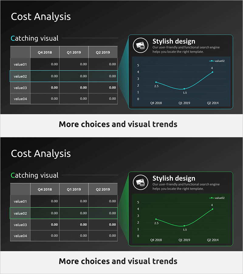
A line chart PowerPoint slide designed for business operation cost analysis presentations. The slide features a teal-colored minimalist background with a line graph tracking cost changes across three quarters (Q4 2018, Q1 2019, Q2 2019). On the left side, a data table displays four cost items (value01 through value04) with corresponding quarterly values. The right side presents a line chart that visualizes cost trends over time with three data series, making it easy to identify patterns and fluctuations. This presentation slide is ready to use for financial planning, cost management reports, operational performance reviews, and investor communications.
Usage Points
-
Main Usage
Visualizes quarterly or monthly cost fluctuations to communicate financial performance clearly. The line chart enables quick identification of cost increase and decrease patterns, while the left-side table provides precise numerical data for credible financial analysis and reporting.
-
How to Use
Replace the table items (value01–value04) with actual cost categories such as labor, operations, and marketing expenses. Update the line chart data points to reflect your quarterly or monthly figures. Use this slide when presenting cost management status in quarterly reviews, executive reports, investor presentations, and budget planning meetings.
-
Recommended For
CFOs, finance managers, executives, business managers, and consultants presenting cost analysis and financial planning. Particularly effective for quarterly performance reports, budget review meetings, and strategic planning sessions where cost trends need explanation.
-
Slide Structure
Two-slide layout with each slide containing a 4-row by 3-column data table on the left (value01–value04 × Q4 2018, Q1 2019, Q2 2019) and a line chart on the right (3 data series, 0–5 scale, 3 data points). Teal accent lines and white typography provide strong contrast against the dark background for optimal readability.
Related Products
-

Cost Increase Rate Analysis Chart
#Financial Plans and Performance #Diagram #Graph
-

Business Outlook Analysis Chart – Future Predictions and Planning
#Financial Plans and Performance #Diagram #Graph
-

Selling Cost Analysis Chart – Clearly Illustrating Financial Performance
#Financial Plans and Performance #Diagram #Graph
-

Production Cost Variance Analysis Chart – Visualizing Financial Performance
#Financial Plans and Performance #Diagram #Graph
