Selling Cost Analysis Chart – Clearly Illustrating Financial Performance
RM0600004_15
- Last Update 02/24/2025
- File Size 0.3MB
- # of Slides 2
- File Format PPTX
- Slide Ratio 16:9
- Color
Keywords
- #Content-Based Slides
- #Design-Based Slides
- #Financial Plans and Performance
- #Diagram
- #Graph
- #Budget
- #Sales and Revenue
- #Table
- #Line
- #Line Chart
- #16:9
- #line chart PowerPoint
- #sales cost analysis slide
- #financial chart template
- #cost trend graph
- #quarterly analysis presentation
- #data visualization slide
About the Product
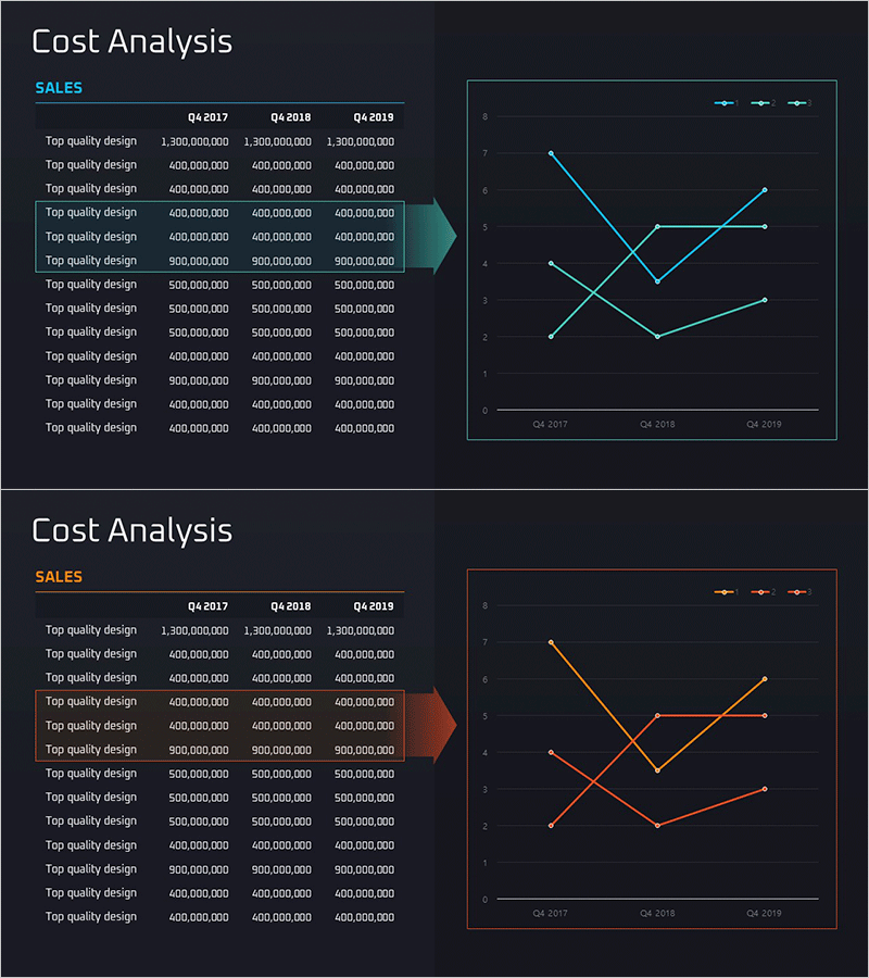
A line chart PowerPoint slide designed for sales cost analysis presentations. This slide features three data series displayed as line graphs tracking quarterly cost trends from Q4 2017 through Q4 2019. The dark background with cyan, orange, and green line series creates a professional visualization ideal for financial performance reporting. The 2-slide set is formatted in 16:9 widescreen PPTX. Perfect for presenting cost fluctuations, departmental budget execution, quarterly performance comparisons, and trend analysis in financial reports and executive presentations.
Usage Points
-
Main Usage
Display quarterly sales cost trends and departmental expense changes over time for financial performance reporting. The three-line structure enables simultaneous comparison of multiple cost categories, supporting cost efficiency analysis and budget execution reviews in executive presentations.
-
How to Use
Incorporate into financial reports, business performance presentations, and management briefings to explain cost trends. Customize line colors to represent different cost categories such as sales expenses, administrative costs, and marketing budgets. Update data points to reflect actual figures and adjust axis labels as needed.
-
Recommended For
Finance teams, executives, and business managers presenting quarterly cost analysis and budget performance. Ideal for budget planning sessions, cost reduction strategy discussions, and departmental performance evaluations requiring data-driven decision support.
-
Slide Structure
Two-slide set. First slide displays three cyan-colored line series tracking cost changes across six quarters with clear axis labels and legend. Second slide presents the same graph structure with orange and green line series, offering alternative color scheme options. Both slides feature dark backgrounds with gridlines for enhanced readability and professional appearance.
Related Products
-

Production Cost Variance Analysis Chart – Visualizing Financial Performance
#Financial Plans and Performance #Diagram #Graph
-

Business Operation Cost Analysis Graph – Core of Financial Planning
#Financial Plans and Performance #Diagram #Graph
-

Business Outlook Analysis Chart – Future Predictions and Planning
#Financial Plans and Performance #Diagram #Graph
-

Cost Increase Rate Analysis Chart
#Financial Plans and Performance #Diagram #Graph
