Sales Profit Margin Change Factor Analysis via Vertical Bar Chart
RM0600005_13
- Last Update 02/24/2025
- File Size 0.3MB
- # of Slides 2
- File Format PPTX
- Slide Ratio 16:9
- Color
Keywords
- #Content-Based Slides
- #Design-Based Slides
- #Business Strategy
- #Market and Competitor Analysis
- #Graph
- #Production Plan
- #Market Analysis
- #Column
- #Segmented Column
- #16:9
- #vertical stacked bar chart PowerPoint
- #sales profit margin analysis slide
- #financial performance graph
- #data visualization PPT
- #how to create stacked bar chart in PowerPoint
About the Product
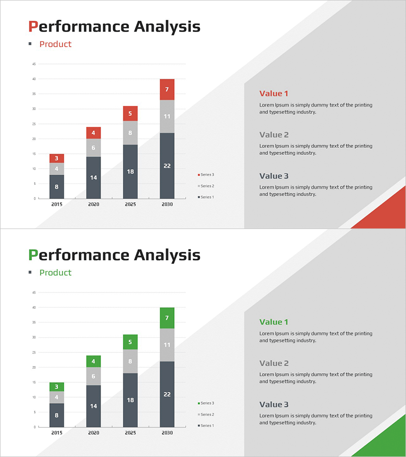
A vertical stacked bar chart PowerPoint slide designed to visualize sales and profit margin changes across multiple data series. This presentation template displays four data series from 2015 to 2030, enabling year-over-year trend analysis and compositional ratio comparison simultaneously. The color scheme—red, gray, and black tones—aligns with financial performance presentations. The right-side text area accommodates Value 1, 2, and 3 explanations to highlight key insights. Optimized for 16:9 widescreen format, this slide integrates seamlessly into modern business presentations.
Usage Points
-
Main Usage
Clearly visualize year-over-year sales and profit margin trends while simultaneously displaying the compositional ratio of four data series, enabling effective financial performance analysis and executive reporting.
-
How to Use
Input actual sales, profit margin, cost, and other financial metrics into the left-side stacked bar chart. Add key insights and analysis findings to the right-side text boxes. All colors and values are fully editable to match your corporate branding.
-
Recommended For
Finance teams, executives, and investors presenting quarterly or annual performance reports; business plan financial performance sections; consulting proposals featuring market analysis and profitability assessments.
-
Slide Structure
Left side: stacked vertical bar chart spanning 2015–2030 with four data series (Series 1–3 plus top value). Right side: three text explanation areas (Value 1, 2, 3). Data labels displayed above bars for precise information delivery.
Related Products
-

Market Analysis Visualization with Vertical Stacked Column Chart – Efficient Competitor Analysis
#Market and Competitor Analysis #Financial Plans and Performance #Graph
-

Analysis of 3D Printing Progress – Market Trends and Insights
#Market and Competitor Analysis #Graph #Market Analysis
-

Graph of Changes in Media Utilization
#Market and Competitor Analysis #Graph #Future Outlook
-

Stack Bar Chart Map for Market and Competitor Analysis
#Market and Competitor Analysis #Marketing Plan and Strategy #Graph
