Cash Flow and Financial Indicators Correlation Table – Insights on Financial Performance
RM0600003_28
- Last Update 02/23/2025
- File Size 0.3MB
- # of Slides 2
- File Format PPTX
- Slide Ratio 16:9
- Color
Keywords
- #Content-Based Slides
- #Design-Based Slides
- #Financial Plans and Performance
- #Diagram
- #Sales and Revenue
- #Key Financial Indicators
- #Table
- #16:9
- #financial indicators correlation table PowerPoint
- #cash flow analysis slide
- #financial data comparison table
- #financial performance PPT
- #3-year financial metrics template
About the Product
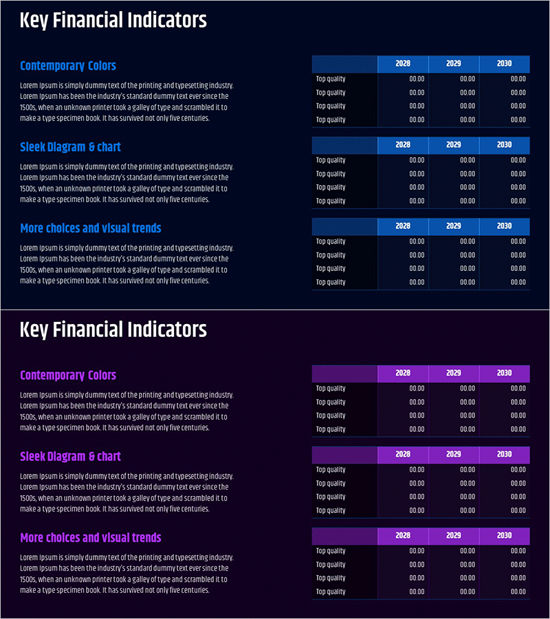
A professional PowerPoint slide comparing cash flow and key financial indicators across three years (2028–2030) with a dark navy background, blue header, and white text layout. This slide is optimized for financial performance analysis and investor presentations, featuring four data entry rows per section for easy year-over-year comparison. The structured table design enables clear visualization of financial metrics and trends. Ready to use in presentations, reports, and financial briefings.
Usage Points
-
Main Usage
Visually compare year-over-year cash flow and key financial metrics (profitability, liquidity, efficiency) to communicate financial performance transparently. Strengthens credibility in investor relations materials, financial reports, and executive briefings.
-
How to Use
Enter financial indicator values for each year in the designated data cells. Customize section headers (Contemporary Colors, Sleek Diagram, More choices) to match your document context, then populate the three year columns with actual financial data for comparative analysis.
-
Recommended For
CFOs, finance managers, and investor relations professionals presenting financial performance to executives, investors, and financial institutions. Ideal for business plans, investment pitches, quarterly financial reports, and annual performance presentations.
-
Slide Structure
Dark navy background with blue header area for section titles, three year columns (2028–2030) on the right, four data entry rows on the left for metric names. Table layout with editable cells for numerical data, optimized for year-over-year financial comparison and trend analysis.
Related Products
-

Key Financial Indicators by Year – Insights for Financial Analysis
#Financial Plans and Performance #Diagram #Sales and Revenue
-

Key Financial Indicators by Sector – Concise and Stylish Design
#Financial Plans and Performance #Diagram #Sales and Revenue
-

Minimal Block Table for Revenue and Profit Analysis – Emphasizing Financial Performance
#Financial Plans and Performance #Diagram #Sales and Revenue
-

Farm Key Financial Indicators Table Chart – Intuitive Presentation of Financial Performance
#Financial Plans and Performance #Diagram #Sales and Revenue
