Bar Graph of Comparative Analysis of Operating Profit
RM0600003_12
- Last Update 02/23/2025
- File Size 0.3MB
- # of Slides 2
- File Format PPTX
- Slide Ratio 16:9
- Color
Keywords
- #Content-Based Slides
- #Design-Based Slides
- #Market and Competitor Analysis
- #Financial Plans and Performance
- #Graph
- #Other
- #Market Analysis
- #Sales and Revenue
- #16:9
- #sales operating profit bar chart PowerPoint
- #financial data visualization slide
- #comparative analysis chart PPT
- #revenue trend presentation
- #how to create financial comparison in PowerPoint
About the Product
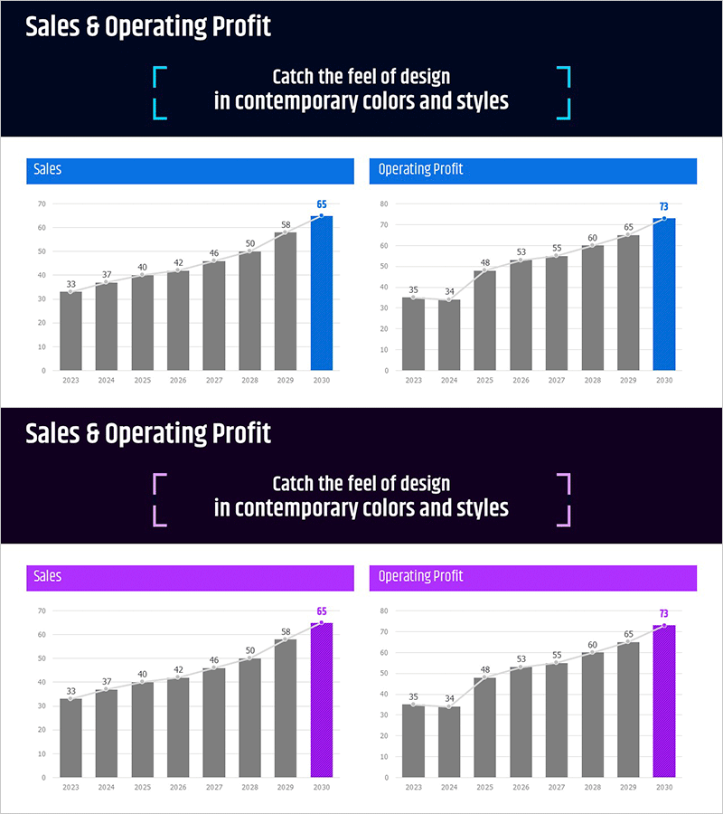
A dual bar chart PowerPoint slide comparing annual sales and operating profit trends side by side. Featuring a dark navy background with blue accent colors, the slide displays sales data on the left and operating profit on the right in a two-column layout. Each year's figures are clearly labeled with numerical values for easy interpretation. Perfect for financial presentations, investor pitches, and executive reports. Provided in 16:9 PPTX format with clearly defined text and data input areas for seamless editing and customization.
Usage Points
-
Main Usage
Simultaneously compare year-over-year sales and operating profit trends to demonstrate business profitability and financial performance. Ideal for highlighting key metrics in investor relations, financial reporting, and executive presentations.
-
How to Use
Enter actual sales and operating profit data into the left and right chart areas respectively. Update year labels and numerical values to match your reporting period. The slide automatically adjusts bar heights based on input data for immediate presentation use.
-
Recommended For
Finance teams, executives, and investor relations professionals presenting quarterly or annual financial results. Suitable for business plans, investor pitch decks, earnings reports, shareholder meetings, and financial performance reviews.
-
Slide Structure
Dark navy header area with title text space, followed by a two-column layout featuring an 8-year sales bar chart on the left and an 8-year operating profit chart on the right. Each chart uses gray baseline bars with blue accent bars for clear comparative analysis and data distinction.
Related Products
-

Business Plan Presentation Template - World Wide Map
#Market and Competitor Analysis #Financial Plans and Performance #Graph
-

Regional Demand Survey Graph – Key to Market Analysis
#Market and Competitor Analysis #Financial Plans and Performance #Graph
-

Horizontal Bar Chart Visualizing Market Sales Status
#Market and Competitor Analysis #Financial Plans and Performance #Graph
-

Sales and Profit Analysis Chart – Data Driven Insights
#Market and Competitor Analysis #Financial Plans and Performance #Diagram
