Sales and Profit Analysis Chart – Data Driven Insights
RM0100012_16
- Last Update 01/28/2025
- File Size 1.3MB
- # of Slides 2
- File Format PPTX
- Slide Ratio 16:9
- Color
Keywords
- #Content-Based Slides
- #Design-Based Slides
- #Market and Competitor Analysis
- #Financial Plans and Performance
- #Diagram
- #Graph
- #Other
- #Market Analysis
- #Sales and Revenue
- #Table
- #16:9
- #sales analysis PowerPoint slide
- #profit trend chart slide
- #financial data visualization PPT
- #dual curve comparison slide
- #business performance analysis PowerPoint
About the Product
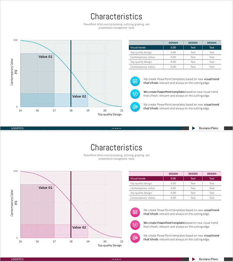
A PowerPoint slide that visualizes sales and profit trends using dual-axis curve graphs. The left side features a large chart area displaying Value 01 and Value 02 trajectories with clear trend lines, while the right side includes a data table and three descriptive points for comprehensive information architecture. Light blue background with dark navy accent lines creates a trustworthy financial analysis atmosphere. The 2-slide set offers both blue and pink color schemes, allowing you to match your corporate brand identity. Provided in fully editable PPTX format, enabling immediate input of actual sales and profit figures without design constraints.
Usage Points
-
Main Usage
Enables stakeholders to compare quarterly or annual sales and profit trends at a glance, clearly communicating profitability trajectory changes to decision-makers. The curve intersection points and slope variations intuitively represent profit margin evolution, while the right-side data table provides precise numerical validation.
-
How to Use
Deploy in investor relations materials, executive dashboards, quarterly earnings presentations, and financial review meetings. Input actual sales and profit data into the left chart area, populate the right table with specific figures and KPIs, then add key insights to the three explanation points below the chart.
-
Recommended For
Optimized for CFO, finance manager, executive, and investor presentations. Ideal for public company earnings disclosures, startup fundraising pitch decks, M&A negotiation materials, and internal board-level financial reviews where financial credibility is paramount.
-
Slide Structure
Slide 1 (Blue): Title area + left-side dual curve graph (Value 01 and Value 02 labeled) + right-side data table (Visual trends with 3 rows) + bottom three circular icon callouts. Slide 2 (Pink): identical layout with color variation. All text, numerical values, and chart data are fully editable.
Related Products
-

Business Forest Wide Template Europe Map – A New Horizon for Market Analysis
#Market and Competitor Analysis #Financial Plans and Performance #Diagram
-

User Gender Ratio Analysis Graph
#Market and Competitor Analysis #Diagram #Graph
-

America Map and Icon Sign – Effective Tool for Market Analysis
#Market and Competitor Analysis #Financial Plans and Performance #Diagram
-

Sales and Profit Growth Trend Analysis Graph – Market and Financial Performance
#Market and Competitor Analysis #Financial Plans and Performance #Graph
