Graph Comparing Performance by Major Business Divisions - Efficient Financial Planning
RM0600002_12
- Last Update 02/23/2025
- File Size 1.2MB
- # of Slides 2
- File Format PPTX
- Slide Ratio 16:9
- Color
Keywords
- #Content-Based Slides
- #Design-Based Slides
- #Market and Competitor Analysis
- #Financial Plans and Performance
- #Graph
- #Other
- #Market Analysis
- #Sales and Revenue
- #16:9
- #sales chart PPT slide
- #operating profit PowerPoint graph
- #financial data visualization slide
- #revenue trend comparison PPT
- #business performance chart template
About the Product
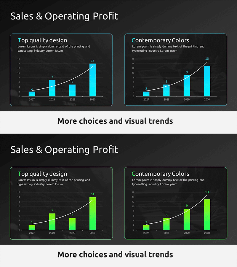
A PowerPoint slide visualizing sales and operating profit trends through two comparative charts on a dark background. Cyan and lime green accent colors enhance data readability and visual impact. Each chart displays 4-year growth from 2027 to 2030 using line graphs and bar charts simultaneously, with dedicated title and description text areas. Ideal for financial reports, investor presentations, and business performance announcements where revenue growth and profitability need immediate visual emphasis.
Usage Points
-
Main Usage
Simultaneously visualize annual sales and operating profit growth trends to clearly communicate business profitability improvements to investors, executives, and partners. Dual representation using line and bar graphs emphasizes both growth rate and absolute values.
-
How to Use
Deploy in investor relations materials, quarterly and annual business performance presentations, and financial report profitability sections. The dark background ensures clarity in projector environments, while text areas accommodate company-specific performance narratives to reinforce credibility.
-
Recommended For
CFOs and financial officers, investor relations professionals, business performance report creators, executive presentation teams. Particularly effective when quarterly or annual results must be conveyed through data-driven persuasion.
-
Slide Structure
2-slide set: Slide 1 features 'Sales & Operating Profit' title with dual charts (left cyan-accented, right lime green-accented) and individual chart description areas. Slide 2 presents color variation (cyan to lime green transition) of the same data with alternative visual emphasis. 16:9 widescreen format optimized for contemporary presentation environments.
Related Products
-

Business Plan Presentation Template - World Wide Map
#Market and Competitor Analysis #Financial Plans and Performance #Graph
-

Sales and Profit Analysis Chart – Data Driven Insights
#Market and Competitor Analysis #Financial Plans and Performance #Diagram
-

Regional Demand Survey Graph – Key to Market Analysis
#Market and Competitor Analysis #Financial Plans and Performance #Graph
-

Sales and Profit Growth Trend Analysis Graph – Market and Financial Performance
#Market and Competitor Analysis #Financial Plans and Performance #Graph
