Key Financial Indicators by Sector – Concise and Stylish Design
RM0600002_28
- Last Update 02/23/2025
- File Size 1.1MB
- # of Slides 2
- File Format PPTX
- Slide Ratio 16:9
- Color
Keywords
About the Product
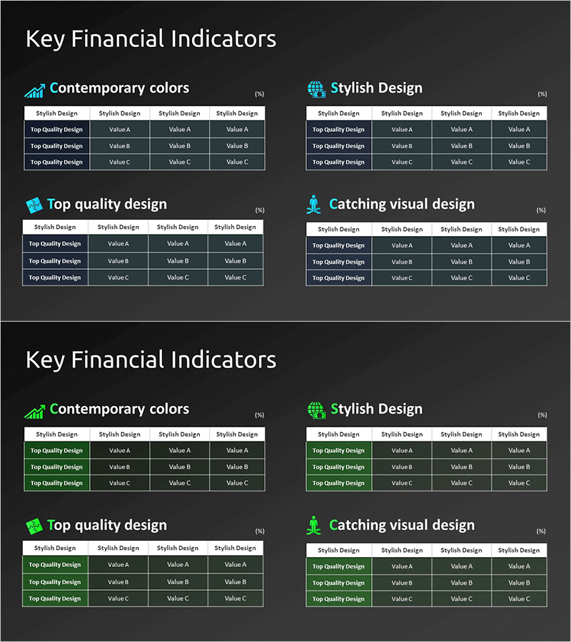
A professional PowerPoint slide for comparing key financial performance metrics across multiple dimensions. Featuring a dark gray background with white typography and cyan accent icons, this 2-slide set presents four comparison sections (Contemporary colors, Stylish Design, Top quality design, Catching visual design) side by side. Each section contains a 3-row by 4-column table structure for inputting Value A, B, and C data points, making it ideal for investor presentations, financial reports, and performance analysis decks. The 16:9 widescreen PPTX format ensures compatibility with all presentation environments and allows seamless data integration.
Usage Points
-
Main Usage
Present and compare key financial metrics across different analytical perspectives to stakeholders and executives. The dark gray background with cyan accent icons conveys both professionalism and data-driven credibility, making financial performance indicators immediately comprehensible.
-
How to Use
Input financial metric names (revenue, operating profit, ROI, etc.) and corresponding values into each table cell. Each section can emphasize different analytical angles (color strategy, design quality, visual impact), and the slide integrates seamlessly into investor IR materials, quarterly earnings reports, and financial performance presentations.
-
Recommended For
CFOs, financial managers, and IR teams preparing investor presentations, financial reports, quarterly performance analyses, and executive briefings. Also suitable for financial consulting materials, corporate performance analysis presentations, and situations requiring side-by-side comparison of key financial indicators.
-
Slide Structure
Both slides follow an identical 4-section layout. Each section consists of a section title with icon plus a 3-row by 4-column data table. The first row serves as the header (Stylish Design), while the remaining three rows provide data entry areas (Top Quality Design with Value A, B, C). Clear spacing and divider lines establish distinct information hierarchy.
Related Products
-

Orange Hexagon Presentation Template Table – Visualization of Revenue and Profit
#Financial Plans and Performance #Diagram #Sales and Revenue
-

Blue Green Climbing Table Chart – Visualization of Financial Performance
#Financial Plans and Performance #Diagram #Sales and Revenue
-

Farm Key Financial Indicators Table Chart – Intuitive Presentation of Financial Performance
#Financial Plans and Performance #Diagram #Sales and Revenue
-

Table Chart and Descriptive Text – Visualizing Sales Metrics
#Financial Plans and Performance #Diagram #Sales and Revenue
