Management Performance Comparison Analysis Chart – Business Strategy and Outcome Visualization
RM0500008_15
- Last Update 02/22/2025
- File Size 0.3MB
- # of Slides 2
- File Format PPTX
- Slide Ratio 16:9
- Color
Keywords
- #Content-Based Slides
- #Design-Based Slides
- #Business Strategy
- #Market and Competitor Analysis
- #Graph
- #Achievements
- #Market Analysis
- #Horizontal Bar
- #Horizontal Bar Chart
- #16:9
- #horizontal bar chart PowerPoint
- #management performance slide template
- #trend comparison presentation
- #business achievement visualization
- #year-over-year analysis slide download
About the Product
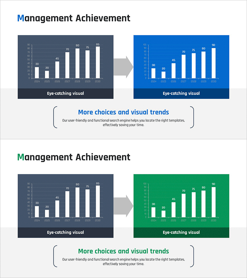
A 2-slide PowerPoint presentation visualizing management performance trends with a before-and-after structure. The first slide features a dark gray background with white bars, while the second transforms to a bright blue or green background, effectively highlighting data improvement. The chart displays 8 years of data from 2024 to 2030 (30→20→45→70→80→75→85→90) in horizontal bar format, emphasizing business strategy execution and achievement results. Delivered in 16:9 widescreen PPTX format, fully editable for immediate use in executive presentations, investor pitches, and performance reports.
Usage Points
-
Main Usage
Visualizes annual performance metrics and trend changes using horizontal bar charts to clearly communicate business strategy execution results and goal achievement. The before-and-after structure emphasizes improvement trajectory, supporting credible data communication for executive presentations, investor meetings, and stakeholder briefings.
-
How to Use
The first slide presents current status with a dark gray background chart, while the second slide displays improved results in bright blue or green. Double-click each year's data value to edit and input actual figures. Customize colors, fonts, and backgrounds to match your organization's branding guidelines and presentation standards.
-
Recommended For
Ideal for business plans, management reports, investor pitches, quarterly performance reviews, and strategic planning meetings. Finance teams, marketing departments, project leaders, and executives benefit from this template when emphasizing year-over-year performance trends in internal and external presentations.
-
Slide Structure
2-slide layout featuring horizontal bar charts for 8 years (2024–2030). First slide: dark gray background with white bars; second slide: bright blue or green background with white bars, creating strong visual contrast. Y-axis shows numeric range (0–90), X-axis displays year labels clearly for easy data interpretation and comparison.
Related Products
-

Bar Chart Visualizing Housing Preferences Survey
#Business Strategy #Market and Competitor Analysis #Graph
-

Arctic Market Future Outlook Bar Chart
#Business Strategy #Market and Competitor Analysis #Diagram
-

Visualizing Achievements through Design Innovation – Reflecting Latest Trends
#Business Strategy #Market and Competitor Analysis #Diagram
-

User Market Analysis Graph
#Market and Competitor Analysis #Graph #Market Analysis
