Bar Chart Visualizing Housing Preferences Survey
RJ0900030_22
- Last Update 08/25/2025
- File Size 0.8MB
- # of Slides 2
- File Format PPTX
- Slide Ratio 16:9
- Color
Keywords
- #Content-Based Slides
- #Design-Based Slides
- #Business Strategy
- #Market and Competitor Analysis
- #Graph
- #Achievements
- #Market Analysis
- #Horizontal Bar
- #Horizontal Bar Chart
- #16:9
- #horizontal bar chart PowerPoint
- #bar graph slide template
- #housing preference survey chart
- #market analysis graph
- #data visualization PowerPoint slide
About the Product
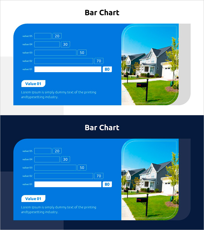
A horizontal bar chart PowerPoint slide visualizing housing preference survey data with five comparative items. The design features a bright blue background with white bars and clear numerical labels, complemented by a residential property image on the right side to reinforce the topic relevance. Two slide versions are included—one with a light blue background and one with a dark background—allowing you to select based on your presentation environment. This ready-to-use slide deck is ideal for market analysis reports, business strategy presentations, customer preference surveys, and real estate industry communications.
Usage Points
-
Main Usage
Compare and rank five data items—such as housing preferences, market analysis metrics, or customer satisfaction scores—using a horizontal bar chart format. The visual layout enables quick comprehension of relative values and supports data-driven decision-making in business reports.
-
How to Use
Slide 1 features a light blue background; Slide 2 offers a dark background option. Choose the version that best suits your presentation venue lighting and projector settings. Double-click the bar lengths and numerical labels to edit with your own data. The right-side image area can be replaced with relevant real estate or property photography.
-
Recommended For
Real estate and construction marketing professionals, market research analysts, business planning teams, and investment pitch presenters. Recommended for housing purchase preference analysis, regional demand assessment, customer segmentation data, and property market reports.
-
Slide Structure
Five-item horizontal bar chart (value 01–05) with numerical labels (20, 30, 50, 70, 80) + descriptive text box (Value 01 label with placeholder text) + residential property image area on the right. 16:9 widescreen format with balanced left-side chart and right-side image layout.
Related Products
-

Arctic Market Future Outlook Bar Chart
#Business Strategy #Market and Competitor Analysis #Diagram
-

Management Performance Comparison Analysis Chart – Business Strategy and Outcome Visualization
#Business Strategy #Market and Competitor Analysis #Graph
-

Competitor Analysis Area Graph – Visualizing Market Status
#Market and Competitor Analysis #Graph #Market Analysis
-

Donut Chart Comparison Slide | Data Visualization PPT
#Business Strategy #Market and Competitor Analysis #Graph
