Management Performance Analysis Mixed Chart – Visualizing Strategies and Achievements
RM0500005_15
- Last Update 02/21/2025
- File Size 0.2MB
- # of Slides 2
- File Format PPTX
- Slide Ratio 16:9
- Color
Keywords
- #Content-Based Slides
- #Design-Based Slides
- #Business Strategy
- #Market and Competitor Analysis
- #Graph
- #Other
- #Achievements
- #Market Analysis
- #16:9
- #management performance analysis PowerPoint slide
- #mixed chart presentation
- #business achievement visualization slide
- #performance data chart PPT
- #how to create performance analysis in PowerPoint
About the Product
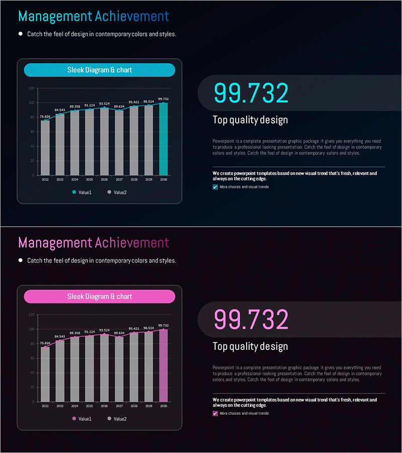
A 2-slide mixed chart PowerPoint presentation that visualizes business performance and strategic achievements simultaneously. The dark background features cyan and magenta accent colors with bar graphs and numerical data arranged to clearly display year-over-year performance trends. The bright accent colors highlight key data areas against the dark tone, making it ideal for investor presentations, executive reports, and quarterly performance reviews. Text input areas and chart zones are clearly separated for easy data editing and customization.
Usage Points
-
Main Usage
Presents year-over-year business performance trends and strategic achievements in a single view. Combines bar graphs with numerical data to provide quantitative evidence and support credible performance reporting to investors, executives, and stakeholders.
-
How to Use
Insert into business plans, quarterly performance reports, or investor pitch decks in the performance analysis section. Input existing data into the chart and add key messages in the text areas. Cyan and magenta colors can be customized to match brand guidelines.
-
Recommended For
Finance teams, executives, and business development professionals presenting quarterly or annual performance results. Suitable for investor meetings, shareholder assemblies, executive briefings, and departmental performance reviews requiring data-driven decision support.
-
Slide Structure
2-slide layout with each slide featuring a title area (top cyan/magenta banner), central bar chart zone displaying two data series (Value1, Value2), and a right-side emphasis area for key numerical metrics. Asymmetrical design balances left-side comparative data visualization with right-side highlighted figures.
Related Products
-

Analysis Graph of Key Performance and Corporate Growth Indicators – Emphasizing Business Achievements
#Business Strategy #Market and Competitor Analysis #Graph
-

Management Performance Analysis Mixed Chart – Data Insights and Strategic Analysis
#Business Strategy #Market and Competitor Analysis #Graph
-

Selected Area Graphs – Market and Performance Analysis
#Business Strategy #Market and Competitor Analysis #Graph
-

Graph of Major Projects and Success Stories - Business Achievement
#Business Strategy #Market and Competitor Analysis #Graph
