Management Performance Comparison Analysis Chart – Data-Driven Decision Making
RM0500003_15
- Last Update 02/20/2025
- File Size 1.4MB
- # of Slides 2
- File Format PPTX
- Slide Ratio 16:9
- Color
Keywords
- #Content-Based Slides
- #Design-Based Slides
- #Business Strategy
- #Market and Competitor Analysis
- #Graph
- #Other
- #Achievements
- #Market Analysis
- #16:9
- #management performance comparison PPT
- #multi-metric chart slide
- #business performance PowerPoint
- #bar graph data visualization
- #decision-making analysis slide
About the Product
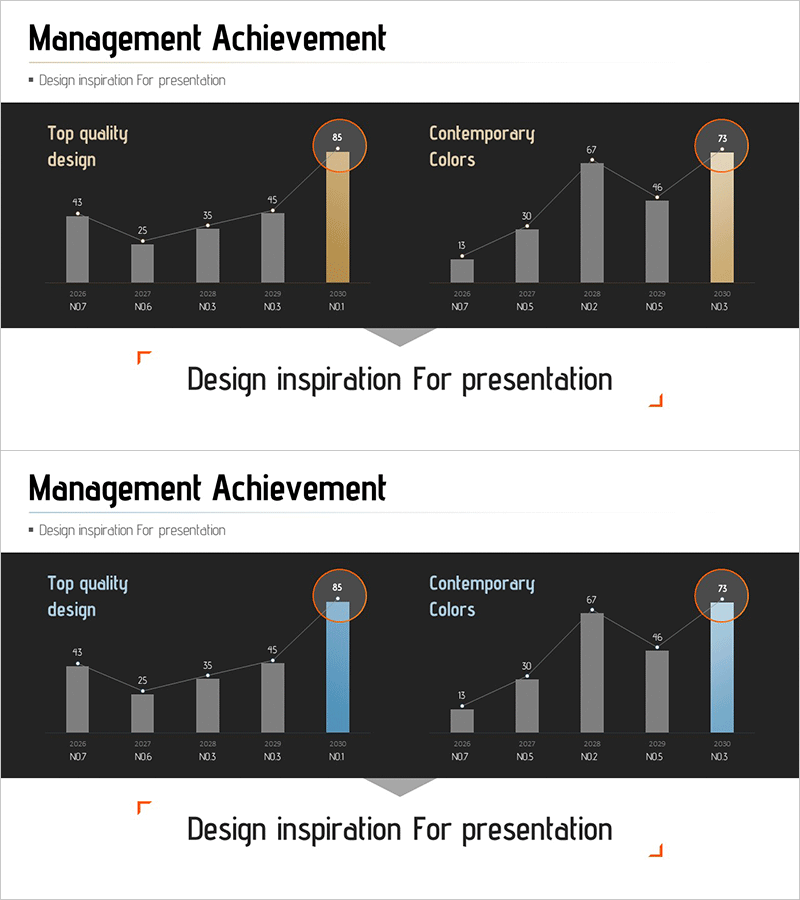
A 2-slide PowerPoint presentation for comparing business performance metrics across multiple dimensions. The slides feature a dark background with gray and accent-colored (gold and blue) bar charts displaying five time periods and two parallel categories (Top quality design and Contemporary Colors). Each bar is labeled with numerical values and topped with circular icons highlighting peak performance. The structure is fully editable in PowerPoint, allowing you to input your own performance data and create professional analytical presentations instantly.
Usage Points
-
Main Usage
Visualize key performance indicators in executive reports, investor presentations, and business performance analyses to support decision-making. Multi-metric comparison enables stakeholders to grasp performance trends and category differences at a glance, with accent colors highlighting top achievements.
-
How to Use
Replace the bar chart values and labels with your own performance data. Edit the time periods (M07–M01) and category names, then adjust the accent color position to emphasize your desired performance metrics. The dark background ensures excellent readability during projector presentations.
-
Recommended For
CFOs, executives, and business managers presenting quarterly or monthly performance results. Ideal for investor IR materials, executive meeting presentations, and business performance analysis reports. Applicable across finance, sales, marketing, and other departments for comparative performance analysis.
-
Slide Structure
Two-slide format with title area (Management Achievement), subtitle (Design inspiration for presentation), and two graph sections. Left section shows Top quality design, right section shows Contemporary Colors, each with five data entry areas for time-period metrics.
Related Products
-

Graph of Major Projects and Success Stories - Business Achievement
#Business Strategy #Market and Competitor Analysis #Graph
-

Eco-friendly Survey Graph – Environmental Protection and Data Utilization
#Business Strategy #Market and Competitor Analysis #Graph
-

Selected Area Graphs – Market and Performance Analysis
#Business Strategy #Market and Competitor Analysis #Graph
-

Management Performance Analysis Mixed Chart – Visualizing Strategies and Achievements
#Business Strategy #Market and Competitor Analysis #Graph
