Market Trend Line Comparison Analysis Chart
RM0400013_6
- Last Update 02/18/2025
- File Size 0.7MB
- # of Slides 2
- File Format PPTX
- Slide Ratio 16:9
- Color
Keywords
- #Content-Based Slides
- #Design-Based Slides
- #Market and Competitor Analysis
- #Graph
- #Competitor Analysis
- #Industry Trends
- #Line
- #Line Chart
- #16:9
- #line chart PowerPoint slide
- #market trend presentation template
- #multi-series comparison chart
- #data analysis slides
- #competitive analysis PPT
- #trend visualization PowerPoint
About the Product
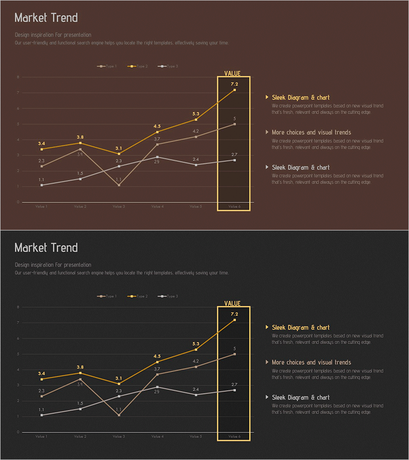
A PowerPoint slide featuring a multi-series line chart that visualizes market data across three distinct data series over six time periods. Set against a rich brown background with gold accent highlighting, this slide effectively displays trend comparisons for competitive analysis, market performance tracking, and sales trajectory presentations. Each series is color-coded (gold, gray, white) for clear differentiation, with data points and numerical labels prominently displayed. The 2-slide set includes both brown and dark background options, making it adaptable to various presentation themes and corporate branding requirements.
Usage Points
-
Main Usage
Visualize market data changes over time and compare multiple data series simultaneously to communicate competitive positioning, growth rates, and market share evolution. The gold accent box highlights peak values or targets, directing audience attention to critical insights and performance milestones.
-
How to Use
Insert into business reports, investor presentations, marketing strategy decks, and quarterly performance reviews in the market analysis, competitive comparison, or financial performance sections. Double-click data points to edit values, and modify series colors to match corporate branding guidelines.
-
Recommended For
Executives, marketing teams, sales professionals, financial analysts, management consultants, and business strategists. Ideal for any presentation requiring quantitative market analysis, competitive benchmarking, market share tracking, or growth trajectory explanation.
-
Slide Structure
2-slide set with identical layouts featuring a 6-point line chart tracking three data series (Value 1 through Value 6). Each slide includes a gold-highlighted box on the right displaying peak value (VALUE 7.2), with adjacent text areas for supporting content such as 'Sleek Diagram & Chart' and 'More choices and visual trends' callouts.
Related Products
-

Competitive Market Trend Analysis Graph – Visualizing Market Trends
#Market and Competitor Analysis #Graph #Competitor Analysis
-

Typographic Wide Template Line Chart – Effective Data Visualization for Market Analysis
#Market and Competitor Analysis #Diagram #Graph
-

Market Trend Analysis Graph & Table Chart
#Market and Competitor Analysis #Diagram #Graph
-

Market Trend Analysis Graph & Table Chart – Insightful Data Visualization
#Market and Competitor Analysis #Diagram #Graph
