Sales Growth Analysis Chart by Sector – A Tool for Understanding Business Status
RM0400009_8
- Last Update 02/17/2025
- File Size 0.7MB
- # of Slides 2
- File Format PPTX
- Slide Ratio 16:9
- Color
Keywords
- #Content-Based Slides
- #Design-Based Slides
- #Product/Service Introduction
- #Business Management
- #Diagram
- #Graph
- #Development Status
- #Implementation Plan
- #Circles
- #Doughnut Chart
- #16:9
- #donut chart PowerPoint
- #pie chart slide template
- #sales analysis diagram
- #revenue ratio visualization
- #business performance PPT slide
About the Product
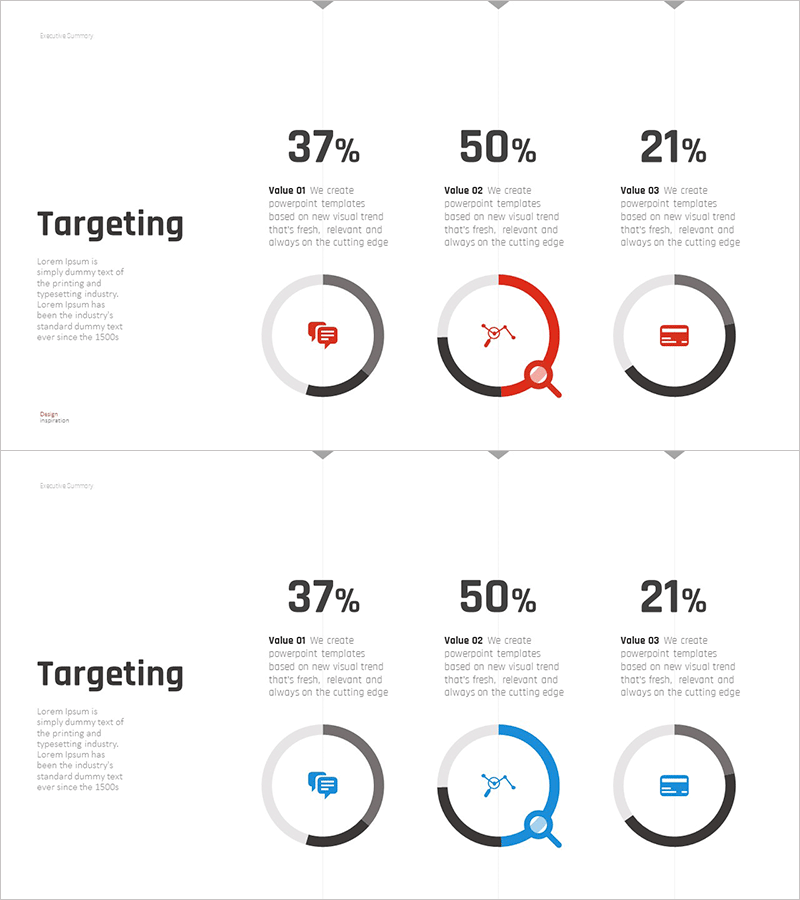
A donut-shaped pie chart PowerPoint slide designed for business status analysis and sector-based revenue tracking. This 2-slide presentation uses a three-segment donut chart with clear color contrast—gray, black, and accent colors (red/blue)—to visualize sales distribution across different categories. Each segment displays percentage values and descriptive text, enabling quick comprehension of growth trends by sector. The slides are ready to use in business reports, strategy presentations, and management reviews. Provided in 16:9 widescreen PPTX format.
Usage Points
-
Main Usage
Visualize sales distribution by sector, department, or product line using a donut chart to communicate business performance intuitively. Ideal for executive briefings, investor presentations, and internal meetings where clear revenue breakdown is essential.
-
How to Use
Replace the percentage values and labels with your actual data to customize the chart immediately. Adjust accent colors to highlight key segments or add supplementary text to enhance the analysis narrative.
-
Recommended For
Business managers, marketing professionals, financial analysts, and executives presenting quarterly or annual sales reports, product-line revenue composition, or regional profit distribution. Suitable for business plans, management reports, and investor pitch decks.
-
Slide Structure
Two-slide layout featuring a centered donut chart (3-segment) with title and description area on the left. Gray background ring, black border, and red/blue accent colors create visual hierarchy. Each segment includes percentage labels and icons for enhanced data communication.
Related Products
-

Cost Structure and Margin Analysis Chart – Donut Slide Providing Business Insights
#Product/Service Introduction #Business Introduction #Diagram
-

Automotive Technology Revenue Model Analysis Chart – Modern and Sleek Design
#Product/Service Introduction #Business Introduction #Diagram
-

Development Status Analysis Connection Diagram – Effective Information Delivery
#Product/Service Introduction #Market and Competitor Analysis #Diagram
-

Mobile App Market Share Analysis Graph
#Product/Service Introduction #Market and Competitor Analysis #Diagram
