Sales Revenue Comparison Chart by Product – Essential Tool for Smart Operations
RM0400006_28
- Last Update 02/16/2025
- File Size 0.9MB
- # of Slides 2
- File Format PPTX
- Slide Ratio 16:9
- Color
Keywords
- #Content-Based Slides
- #Design-Based Slides
- #Operational Plan
- #Financial Plans and Performance
- #Diagram
- #Capital Investment Plan
- #Capital Requirements
- #16:9
- #sales revenue comparison chart PPT
- #strategy performance analysis slide
- #sales comparison PowerPoint
- #business revenue data table
- #how to create revenue comparison in PowerPoint
About the Product
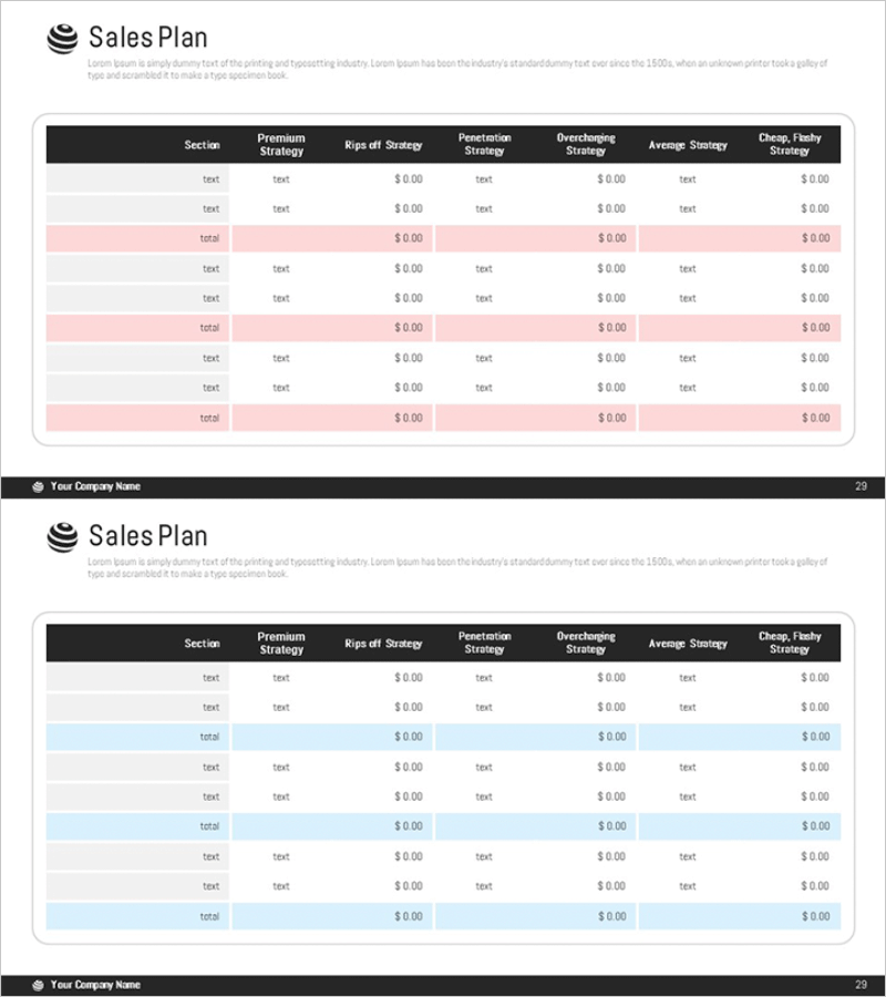
A 2-slide PowerPoint presentation comparing sales revenue across multiple strategies. Features a black header row with pink and blue accent rows highlighting subtotals, displaying premium strategy, rips-off strategy, penetration strategy, overcharging strategy, average strategy, and cheap/flashy strategy performance side by side. The color-coded subtotal rows create clear information hierarchy, making it easy to identify key metrics at a glance. All cells are fully editable in PowerPoint for seamless customization. Ideal for business operations reports, strategy performance analysis, financial planning presentations, and executive briefings.
Usage Points
-
Main Usage
Visualizes revenue performance across multiple sales strategies using numerical data and color coding to support executive decision-making. Highlighted subtotal rows enable quick identification of key metrics, making it essential for sharing business operations status and conducting performance analysis.
-
How to Use
Insert into business plans, quarterly performance reports, or investor pitch decks within the financial and operations sections. Replace table text and figures with your actual data, and use color-coded accent rows to emphasize critical metrics. During presentations, reference each strategy's performance to enhance audience comprehension of financial results.
-
Recommended For
CFOs, financial managers, operations managers, executive reporting specialists, and investor relations professionals presenting financial status and strategy-specific revenue performance. Particularly effective when comparing revenue across multiple business units or sales channels.
-
Slide Structure
Two-slide layout with black header row containing section names, strategy labels, and seven revenue columns. Approximately 20 editable text cells for section names, strategy names, and numerical values. Pink and blue background rows highlight subtotals, creating three-tier information hierarchy for clear data interpretation.
Related Products
-

Table of Operating Capital Securing Strategies – Financial Planning and Performance
#Operational Plan #Financial Plans and Performance #Diagram
-

Sales & Investment Plan Slide Template
#Operational Plan #Financial Plans and Performance #Diagram
-

Sales Revenue Comparison Analysis Table – Effective Operational Planning
#Operational Plan #Financial Plans and Performance #Diagram
-

Promotional Product Sales Revenue Structure Table
#Operational Plan #Financial Plans and Performance #Diagram
